The exhibition ‘Calligraphers Guild’

June 22nd, 2008

In Japan, speaking Calligrapher, it might remind you of Japanese style Calligraphers. However, even in Japan, there are many Western style Calligraphers.

The exhibition titled The works of Calligraphers Guild was held at Gallery Kubota in Chuo Ward, near the Tokyo station. More than 200 works got together and were displayed in four rooms. There were several styles of expressions such as classic, modern, relief and a mixture work Japanese and Western styles.

One of Calligraphers I would like to see, Izumi Shiratani showed a beautiful work. Her work was really great and had gorgeous drawing lines. I’ve been acquainted with her since I met her at some party a few years ago, so I asked her to meet there in order to ask some questions about her recent work and activity.

I also asked her opinion about designing letters. I told her that I would need a Calligraphic style Logotype for package design, so I’ve been looking for a Calligrapher to draw letters for a logotype. I would like to know her opinion about whether Calligrapher would like to have opportunity to design logotype or not, or she can get the offer if I asked her. We exchanged opinions what the difference among art work and design work is, what problems are to design logo work, what art director should do for Calligrapher when they work together. She made me clear there’s nothing to worry about. I’m glad to hear that and I would like to work with Calligraphers to make Logotypes in the future.

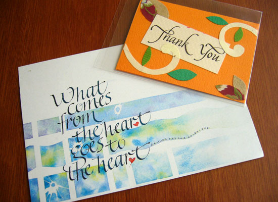
The direct mail and Thank you card for this exhibition.

This exhibition goes around to Sendai, Okayama, Osaka.
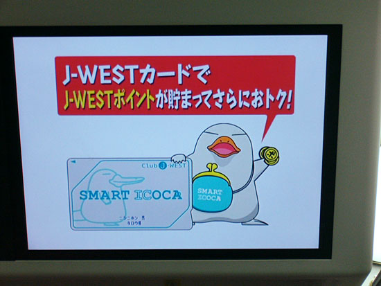
ICOCA Card with typeface “Take”

June 20th, 2008

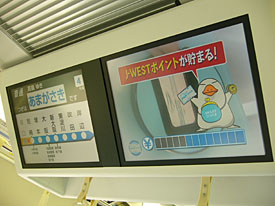
I had a few chances to get back to Kansai where my home town is in the past few days. I used to get on Hankyu Railway while I’d been in Hyogo pref., but now it is better to use JR West line for me because of easily access if I’ve got on Shinkansen, is the bullet train in Japan, when I get back to my home town from Tokyo. I always enjoy to watch the information display, which ran some commercials and information, on the ceiling inside a car.


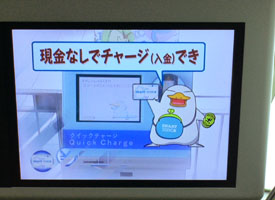
I found a unique commercial for ICOCA card, is a prepaid card for JR West. A unique platypus character, named “Ico-chan”, introduced ICOCA card to the commuter how useful it was. Ico-chan explained about the ICOCA card with call-outs and subtitles. The subtitles used typeface “Take”, which means “bamboo”. “Take” has really unique straight strokes, but the skeleton is not stiff and really natural to my eyes. “Take” have Japanese taste and casual feelings so I would like to use it for package designs such as for Japanese snack foods or tea.

The typeface “Take” won the silver prize of Morisawa award 1993, which had been designed by him and was released as one of Morisawa Liblary last year. The Take’s type designer Mr. Naoyuki Takeshita knows typefaces well about not only Japanese font also Latin typefaces, he taught me what the typeface was immediately when he and I hanged around downtown together. He has his blog and posted several photos on Japanese typefaces which he found in downtown where he hanged around. Called “街でみかけた書体: Machi de mikaketa Shotai”, means the typeface which he found in downtown, is really interesting blog post. It was a pity it is Japanese language only, but you can see several kind of Japanese typefaces on the blog.

Type design in China

June 12th, 2008

I found the results on the 4th Founder Award Competition in Chinese type design from Jongseong’s blog post on Typophile.

Mr. Akira Kobayashi of Linotype joined this competition as a jury last year, and he introduced it on his blog. Since I’d read it, I’ve been looking for the results of the competition.

The resultc of The 4TH “Founder Award” Competition on Chinese font Design and Poster Design (MS Word Document.)

The outline of the competition in English
The 4TH “Founder Award” Competition on Chinese font Design and Poster Design

I was surprised that some of winning designs have gray tone! It reminds me of a Sumi-e, means Ink-and-wash painting. Usually, we should design letters without gray scale tone for digital fonts, but if these design could be used for Flash movies or on monitors, designing letters without gray tone might be nonsense. I thought these strokes with ink bleed and blur seemed to express time goes by. Indeed, we can use gray scale or color to make fonts using BitFonter.

You can also see the results of the past three competitions.

I’m always thinking about how I should design Latin characters that goes with Japanese characters. I enjoyed to think about how I should design Latin characters which goes with these winning designs.

In fact, I don’t know well the situation on Type design in neighboring countries China and Korea, but I think I should introduce type designs in Asian countries like type designers in Arabic countries drastically introduce Arabic fonts to the other countries. Japanese people also use kanji characters but there are slightly different with the ones in China. I know most of people who check this blog might hardly use CJK fonts, but I hope I’ll be able to show you a topic on CJK fonts and typography.

Recommend articles.
Seibundo Shinkosha Co., Ltd. 誠文堂新光社
IDEA magazine 307: Graphic Design in Korea
IDEA magazine 307: “Book Design in China” “Study on the Historical Development of Graphic Design and Typography in China 1805-1949 Text: Sun Mingyuan.”

A coffee meeting with Ian Lynam

May 31st, 2008

15:07 p.m. In front of the JR Shinjuku station, the East ticket gate. Ian didn’t come yet. The time we promised to meet was already passed. I called him. I thought this was the first time I called a native English speaker. “Hi! where are you now?” He seemed to wait at the Central East ticket gate. I thought my explanation might have been wrong to tell him where the meeting place was. And then, I found he was coming toward me.

Ian and I kept in touch with each other since we met last meeting, but we didn’ t have enough time to meet together due to our hard schedule, so we couldn’t arrange the meeting for a while. I’ve been wondering whether the meeting was held for sure, but we decided the meeting day at last! As I thought it was a rare chance to meet with an interesting type guy, I decided I would take my friends, Yutaka Ozawa, who started solo project for Japanese font recently, and Akira Yoshino, who worked for a famous publisher in Japan and is also a moderator on MyFonts com forum, together.

After giving self introduction, we shared each other’s works. First, Ozawa-san showed his East-Asian style Calligraphy works, he also do Western Calligraphy though, and he showed his new type design in progress. Second, I showed Ian my portfolio included my package designs, logo designs and digital type faces that I’m going on. Ian seemed to be interested in my works, so he told me some opinion and asked some questions. And at last Yoshino presented some novels he worked for to Ian.

Ian asked Ozawa some questions about Ozawa’s Calligraphy works and also asked a question to Yoshino about the letter space for Japanese punctuations cited the mystery novel Yoshino brought. Ian often used Japanese text for his works, so he seemed to be interested in Japanese fonts and typography. Ian asked us some questions from Western style point of view. He pointed out Japanese custom. He seemed to be curious the difference between Japanese and Latin text.

I felt silly that I couldn’t explain fluently about my works in English. There seem to be some type guys in Japan who comes from overseas, so I would like to communicate with them. I’ll try to get a chance and plan a meeting at some point.

Thank you for coming in spite of a rainy day, Ian. I hope we’ll meet again soon.

P.S.
He also wrote this meeting on this blog “Viewers Like You”. Thakns, Ian!

TypeCon 2007 Typecrit video

May 23rd, 2008

I went to attend TypeCon Seattle 2007 last year. This was the first time for me to go a type conference was held on overseas. I got a chance to take type critique named “Ten minutes type critique” known as a regular event on TypeCon. Now you can find the audio and specimens on the critique that was held on TypeCon Seattle 2007 on YouTube.

TypeCon Seattle 2007: Typecrit 1 of 4

I recorded everything so that I could listen them after I’d back to home, because I didn’t think I could listen everything due to lack of my English skills,

Eben Sorkin, was one of designers joined 10 minutes critique, asked me to get the audio and he proposed we should provide this audio to every one who was curious about this event. And then, he compiled several photos, specimens, and movies to edit this audio and uploaded to YouTube.

The 10 minutes type critique is a regular event of TypeCon. Three critics provide their opinions to the attendees watching submitted type designs. Matthew Carter, John Dawner, and Akira Kobayashi were the critics at that time. Every attendee have 10 minutes only. They explained their concept and asked critics several questions within 10 minutes. The audience also asked their question about attendees works.

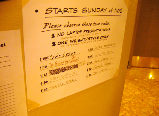
photo:The member list of 10 minutes type critique on the wall of front desk.
I wrote my name third place after someone quit to attend. Great!

This critique was very useful and helpful learning designing typeface. Not only I got several opinions from three critics but also it was useful to hear the opinions to the other designers.
I could understand easily where he important point was or how I should compare with the difference in the element. I’m pretty sure it is worth listening.

I couldn’t believe some famous type designers attended this type crit. Gabriel Meave, who is a really gifted type designer, attended this crit to show his font “Darka”, as you know, got the TDC prize. I though he didn’t need to join this crit because he could do everything! The other two Mexican type designers were also talented. AtypI conference will be held in Mexico City in next year. I guess type design in Mexico must be better to improve drastically.

At the farewell party of TypeCon Seattle, Mr. Dawner told me I should bring my revised type design to Buffalo. Thanks, Mr. Dawner!

P.S.
Related thread on Typophile.
TypeCon 2007 Typecrit video

Parallel Strokes

May 15th, 2008

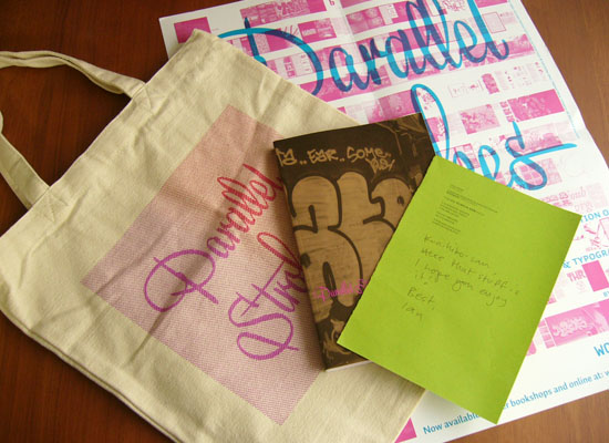
Ian Lynam, who I met at the meeting with Christian Schwartz last month, send me his book titled Parallel Strokes. I just said hello to him before leaving the meeting, so I emailed him and got an appointment to talk about topic on type design with him. Ian interviewed with Akira Kobayashi of Linotype for PingMag a few years ago. I’m aware of who the interviewer is since I read that interview. I didn’t think he lives in Japan.

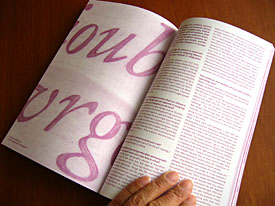
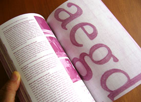
Ian compiled 19 interviews in Parallel Strokes, which includes various type designers and graffiti artists. I enjoyed to know there were various background stories how they started type designs and typographic graffiti at first. Some part of the interview with Akira Kobayashi on PingMag seemed to be edited in order to fit the page, but a lot of photos and some sketches were added in Parallel Strokes. Interviews with Underware and DIAM were also included in it. DIAM is one of my favorite artists since I read the interview article that Ian did for the FontShop magazine a few years ago.


Ian send me his book “Parralel Strokes” and some novelty goods


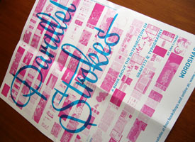
(Left above) Parallel Strokes Poster (Lower right) The DIAM’s photos in
Parallel Strokes reminded me of The FontShop catalogue Issue 005.

Ian is not only a graphic dsigner but also a type designer. He digitized Cooper Black Italic Swash. And he also have his label WordShape.

National Treasures from Yakushi-ji and The Lantingji Xu

April 30th, 2008

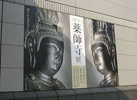
For big fan of ancient Buddhist art, especially for those who hunt National treasures, it was very exciting season and busy to go to museums where hold the exhibition during Golden week holiday. I went to Tokyo National Museum in Ueno park to see the Exhibition of National Treasures from Yakushi-ji Temple. Last week, I went to Shin-Yakushi-ji Temple to see the Twelve generals, and this time, I could see the bronze sculptures of Nikko(日光), means the sun, and Gakko(月光), means the moon, made in Hakuo period (A.D.672-686) as National Treasures.

That’s a good chance that you’ll be able to see the back shot of the sculptures. In most cases, a statue set on the proper place in the hall of temple, you would not be able to see it from behind of it. However, in this exhibition, every statues were standing alone and displayed without their nimbus, besides, there was a deck in front of the Nikko and Gakko so that visitors could see on the same level with both of statues. So I could tell the difference of these looking between the one when I saw on the deck and the other when I could see from lower point.

The appearance of Buddha statue changes depending on where you look at it from. I walked around every bodhisattva statue to find out the best view, but it was hard to decide it. As bodhisattva statue twisted the body, so the outlines of the body gradually changed at every step I took. I enjoyed the variety of the lines.

At the Kichijouten (吉祥天), is also designated National Treasure, booth, it was hard to see it because a lot of people gathered in front of the Kichijouten picture like a wall. The museum staffs made the visitors move along not to stack in front of it, but the visitors tried to stay there as much as possible. Indeed, it was worth watching.

The number of works in this exhibition was small, but almost of them were designated as National Treasure or Important Cultural Properties. It must be rare chance to see them at once, I do recommend you go there. This exhibition is showing untill June 8, 2008.

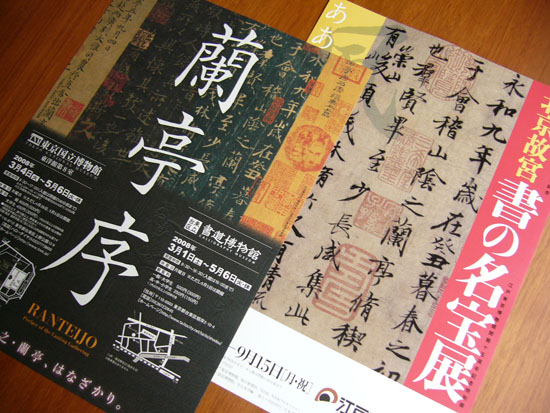
After watching the Exhibition of Yakushi-ji temple, I went to another exhibition whoch was held at the same time in Tokyo National Museum on “The Lantingji Xuin(蘭亭序)”, which is one of the most well-known East Asian style Calligraphy works, but as I was exhausted to see the Yakushi-ji’s works, I couldn’t concentrate on the works of the exhibition “The Lantingji Xuin”. It was a pity that this exhibition will finish on May 6th, but I was relieved to know that another exhibition will be held at Edo-Tokyo Museum in this July named “The Palace Museum. A well-known treasure on Calligraphy” and will display “The Lantingji Xuin” works. I hope to see them again.

NTT DoCoMo announced new brand identity

April 25th, 2008

NTT DoCoMo Inc., one of cell phone service providers in Japan, announced to start its new corporate logo at the beginning of July. The DoCoMo’s new logo consists circular shaped lowercases, changed its brand color into red named Docomo red.

When I looked at the current logo design at first, I thought it was a unique logo design. I loved its funny style which mixed uppercases and lowercases and dots along with the letters. I’m going to buy the next Docomo’s model, but it’s a pity I can’t see the current logo any more. I thought the brand name would be better just only “docomo” without “NTT”.

Take a walk to Shin-Yakushiji temple

April 22nd, 2008

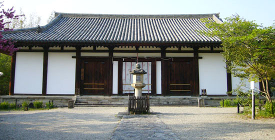
After leaving from Shojudo (see previous topic), I went to Shin-Yakushi-ji Temple in a bit of hurry to get in time for closing time. The master of Shojudo told me it should took around 30 minutes by walk. It was hot day, so I was slightly sweaty. Japanese wisteria trees along the street budded and was almost blooming. To take a short cut, I went through a path linked to the hill where Shin-Yakushiji Temple stands on quietly. I felt Shin-Yakushiji was smaller than I expected.

The front door of the main hall was closed, so I entered to the inside from left side, and then I could see the Juni-Shinsho statues: The twelve divine generals, stood on the floor surrounding the Yakushi-nyorai statue. The inside of the room was dark, but a few candles lit the statues, I was impressed. I couldn’t wait to start watching closely, even though I should have pray the principal statue before watching them. I was really into these statues.

I guessed some of Japanese Mangas and animations had much influenced by the Buddha statue images. For example, the Bassara general, which is one of the Twelve divine generals, reminded me of the Katsuhiro Otomo’s “AKIRA”, which is SF manga. While the Four Heavenly Kings of Todai-ji Temple reminded me of the Gundam, which is the most well known Japanese robot animation, and I could find some common characteristics between these images.

One of the reasons I like the Juni-Shinsho statues was that every statue has its own characteristic looking each. They were soldiers to protect Yakushi-nyorai. I thought they seemed to play their roll saving the principal statue Yakushi-nyorai as if the characters in a fantasy story would try to save a heroine.

Japanese black ink stick, Sumi.

April 21st, 2008

My short trip to Nara was very good and comfortable because fabulous weather and the brilliant green leaves on the trees made me feel good.

I’d visited to almost of famous temples in Nara city, but the last one I’ve never visited before was Shin-Yakushiji, which is famous for several Buddha statues designated National Treasures such as Yakushi-Nyorai and Juni-Shinsho: The twelve divine generals, So I’d been looking forward to seeing them.

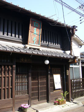
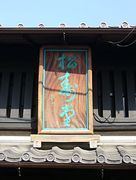
At the JR Nara station, when I looked for a map for tourists to Nara, I happened to get a free sightseeing guidebook of Nara city. I found an interesting photo on an ink stick, which was called Sumi in Japan, and I decided to go to the shop before visiting to Shin-Yakushiji. The shop’s name was Shoujudo “松寿堂” located in an old town. It took about ten minutes to go there from the station by foot.

I hesitated to enter the shop for a while because its facade seemed to be an old-established and really high-toned, but the owner was very happy and welcomed to enter the shop. The inside of the shop was very beautiful and traditional Japanese style, there were many Japanese-traditional furnitures such as wooden step-like chest of drawers.

The master showed me some products, which were the same ones on the guidebook, and explained how to make them. According to the master, the Sumi made in Nara is called Nara Sumi, which has been for more than 600 years since Muromachi period to provide for demand from the temples, mainly Kofuku-ji temple, in Nara area. Shojudo has been making Nara Sumi scince 1865, Edo period, and designated as a royal warrant shop. There were a few Sumi makers in this district a few years ago, but now, Shojudo is the only shop around there. And then, he showed me a Sumigata, the decorative wooden molds made from Asian Nashi, Asian pear, used to form ink sticks.

As I remembered that Prof. Hermann Zapf mentioned about a Japanese ink stick in the movie “The Art of Hermann Zapf”, I told him that I’ve heard some of Calligraphers not only East-Asian style but also European style used a Japanese Sumi as a black ink. Then I proposed him that he would introduce Sumi to Calligraphers who lives in Europe area. The master was very interested in this topic.

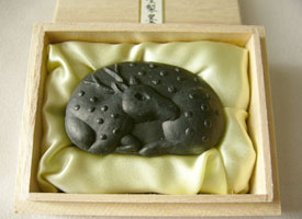
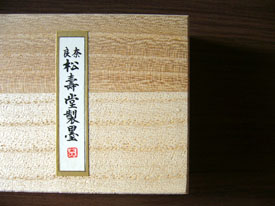
I bought two pieces of Sumi that shaped lovely Japanese deer, which lived in Nara Park and was considered sacred of Kasuga Taisha shrine, in a small box of paulownia wood.
It was a pity that I didn’t have much time left to get until the Shin-yakushiji temple would be closed. I hoped I would like to visit again so that I could get enough time to chat with the master.

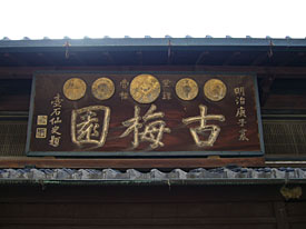
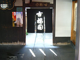
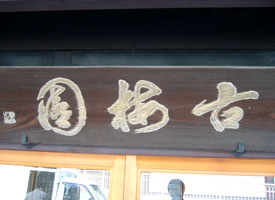
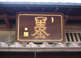
(Above) The wooden shop signages and “Noren: 暖簾”, which is a store curtain hanged on the shop entrance, read “古梅園: Kobaien”on another shop that I found out during return to the Nara station from Shin-Yakushuji temple. (Lower right) The letter “墨: Sumi”, which means ink stick.