Archive for the ‘Info’ Category

Three font-related works got the Good Design Award

Thursday, October 1st, 2009

Japan Industrial Design Promotion Organization announced the results of the Good Design Award 2009 on October 1st. Good Design Award is the only annual comprehensive design commending system in Japan, and the award-winning works get the right to show the G-mark for its promotion on the several kind of media by paying annual fee. The award winning works in 2009 contained three font related works.

Driver’s font
Driver’s font designed by Type Project collaborated with Denso, is the supplier mainly car equipments and air conditioner, got the Frontier Design Award.

Driver’s font was designed to support car drivers in 2007 as a prototype work, which is now in progress to develop, based on the assumption in light of the research for driver’s situation.

While driving a car, a driver needs to concentrate gazing forward and have to glance at information on the equipment panels such a speed mater or car navigation system. The driver recognizes the information by remembering the image what the panels showed after glancing at the panels. The driver repeats these actions concentrating forward. The interval to check panels will change depends on its car speed. To keep the impressions that driver imprinted, the letters needs to be required clear legibility and generating strong impressions. Driver’s font gives driver stabilized visual images by modulating letters along with car speed. When the car in high speed, the letters become a bit bolder to enhance strong images to the driver, on the other hand, the car is staying, the letter looks calm by showing the letter thinner.

Driver’s font has three styles, Urban mode and Enthusiast mode, plus Enthusiast Italic “Power Band”mode for Sports mode. The letters in Enthusiast mode enhanced the characteristics of the letters such as the terminals and thickness of the strokes and serifs, compared with the Urban mode, which helps drivers be able to easily catch the letters on the panels in high speed.

Reference: AXIS magazine vol. 136 contains an article on Driver’s font.

Iwata Universal Design font
Iwata Universal Design font got the Life-Scape Design Award. This font is the pioneer of the Universal Design font trend in Japan. Universal Design font, abbreviated UD Font, is becoming popular in Japanese typeface market after Iwata’s UD font was released in 2006. Above all, Product design field welcomed to use UD fonts designing products with Universal Design philosophy. Iwata collaborated with Panasonic, is the major home-electronics, audio and visual device maker, to make its UD fonts in order to help those with weak-eyes and aged-eyes. The other type foundries followed to make UD fonts.

Fontpark 2.0
MORISAWA Fontpark 2.0 designed by Yugo Nakamura (tha ltd, yugop.com) in 2008 is a unique attraction interface. User can play to draw a picture using strokes and elements of letters from Morisawa Font Library. And it is available to save the picture to the web site, then visitors can watch the archives replaying making process of the work. Enjoy this font park.
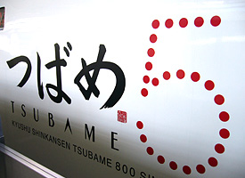
Railway car designs and Letters.

Sunday, May 10th, 2009

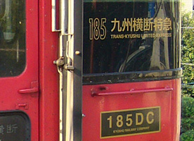
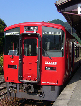
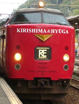
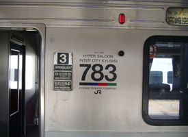
If you were a train geek and want to come to Japan, I do recommend you go to Kyushu island, in southwest part of Japan. If you were a typeface and letter geek, Kyushu is worth visiting to check railway designs. Eiji Mitooka is the most famous train car designer in Japan. Japanese broad casting company TBS (Tokyo Broadcasting System) run the program featured Mitooka last night, I’ve enjoyed to watch it.

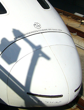
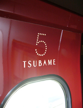
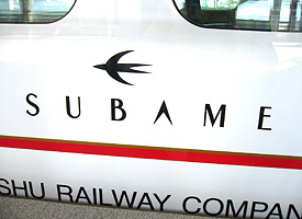
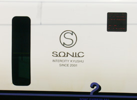
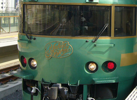
I had been in Kyushu area several times. The one of the times was about four years ago to research the Hisatsu Orange Railway, which runs southwest coast in Kyushu island, and the last time was in last October to trip across Kyushu. Anywhere I would like to go to, I went to there mostly by train. The limited express trains designed by Mitooka such as Kamome, means gull, Sonic, Yufuin no Mori (Forrest in Yufuin) and Kyushu Shinkansen ballet train named Tsubame means swallow, are running across the Kyuhsu island.

Not only the limited expresses, but also commuter trains and the one runs across rural area were very cool and unique. When I was waiting for the next train was coming to the station in rural area, I was astonished that a strong red colored and unique graphic designed train was coming to the station. I thought they looked like European style train cars. The logotypes and typographies of the designs were also great and I was always excited to see them during my trip.


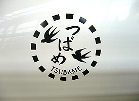
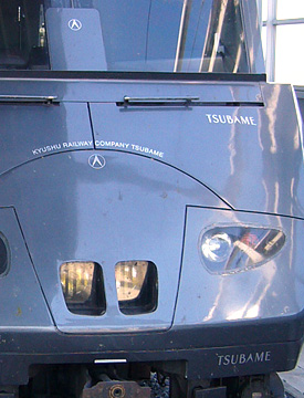
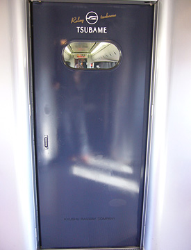
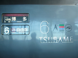
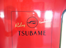
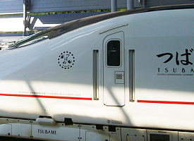
Above: Kyushu Shinkansen ballet train Tsubame. The logos are very cute. “つばめ” means swallows.


Relay Tsubame runs between Hakata and Shin-Yatsushiro, where is still under construction Kyushu ballet train line. Relay Tsubame connects to Kyushu Shinkansen.


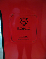
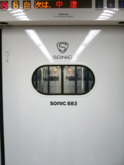
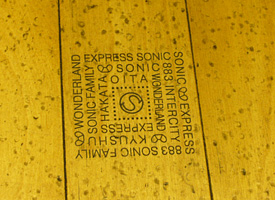
Sonic series Nichirin Right above: The symbol mark comes from the design of the head rest of the passenger seat.

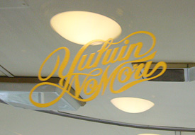
Above: The sightseeing limited express, Yufuin no Mori. Right: The script logo decal on the partition window between the passenger area and the cockpit.

The limited express across Kyushu. The trains run through the Aso volcano area between Kumamoto and Beppu (Oita pref.) The line contains switchback system.


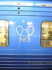
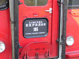
The commuter trains are also unique and have urbanized design. JR group often uses Helvetica to show car numbers. However, Mitooka designs them like a numbering of the Robot Hero Gundum.

After starting my design office last year, my former-supervisor in Osaka introduced me to Mitooka, I had a chance to visit Mitooka’s office in Itabashi Ward, Tokyo. He talked about some stories and episodes of his works for over two hours. ‘I always couldn’t get enough budget to design these logotypes and graphic designs for the train. Mostly of the logo designs were voluntary works,’ Mitooka said. ‘I think it is very important to design logos and to design the layout of letters because train cars definitely need letters and numbers to show the train’s name and car number signs’, he continued.

Indeed, as he mentioned above, he did the best job to design letters and numbers even if they are in a hidden place. Besides, Mitooka always takes care of the design so that children can enjoy to see and to get on trains. In the TV program, he explained the chair he designed that this is the one I wanted (when I was a child). He is always considering designs for children.

When I was child I used to draw trains that run nearby my home town. I loved to see trains and wanted to become a designer for trains. However, I’m a type designer now. I still hope to work for the project for designing trains or railway signs from the viewpoint of a typeface designer in future.

Recommend book. amazon.co.jp, Japanese only.
ぼくは「つばめ」のデザイナー—九州新幹線800系誕生物語』”Boku wa Tsubame no Designer”, means “I’m a designer of Shunkansen Tsubame”, Kyushu Shinkansen Design Story. 水戸岡鋭治著 Author: Eiji Mitooka.

AXIS Compressed has released.

Friday, January 16th, 2009

The rest family fonts of AXIS compact series, AXIS Compressed fonts were finally released on Wednesday, Type Project inc., which is the foundry of Axis font, announced on its press release. AFAIK, no true compressed Japanese digital font for retail has ever seen before in Japan. AXIS compact series, includes AXIS Condensed, already got the Good Design Award in Communication category in 2008.

Some of famous global companies, Apple Japan, Mazda, Wii by Nintendo, have been using AXIS font Basic family, has squared width, for their commercial applications, web sites and TV commercials. And at the end of last year, NTT Docomo also started using AXIS font for its mobile phone devices as a system font. Now, AXIS font could be used for the devices made by Sharp only, but NTT Docomo announced that all of the future Docomo devices will have the AXIS font.

You can download trial fonts of AXIS font family from Type Project site. You need to put your info, includes your name, your address, OS version you are using, to the submit page’s dialog boxes that marked red color. I recommend you use Google translate, if you had been stuck to input them. After submit your info, Type Project will return info mail to your address, which includes the link for the trial fonts. The trial fonts include about 1,000 Kanji characters, Joyo-Kanji only, but it is available Latin alphabet part, Hiragana, Katakana and sign symbols. You will be able to see what the fonts look like. Of course, the regular fonts for retail are available over 7,000 Kanji characters, Adobe-Japan1-3.

Type Project relaunched its web site. And AXIS inc., is the exclusive dealer for AXIS fonts, also relaunched www.axisfont.com and indicated the Latin family of AXIS font, includes Italic family, will be available soon.

ICOCA Card with typeface “Take”

Friday, June 20th, 2008

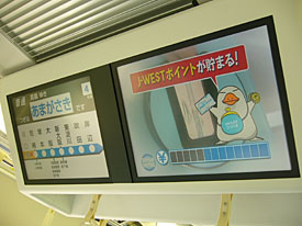
I had a few chances to get back to Kansai where my home town is in the past few days. I used to get on Hankyu Railway while I’d been in Hyogo pref., but now it is better to use JR West line for me because of easily access if I’ve got on Shinkansen, is the bullet train in Japan, when I get back to my home town from Tokyo. I always enjoy to watch the information display, which ran some commercials and information, on the ceiling inside a car.


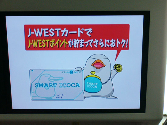
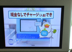
I found a unique commercial for ICOCA card, is a prepaid card for JR West. A unique platypus character, named “Ico-chan”, introduced ICOCA card to the commuter how useful it was. Ico-chan explained about the ICOCA card with call-outs and subtitles. The subtitles used typeface “Take”, which means “bamboo”. “Take” has really unique straight strokes, but the skeleton is not stiff and really natural to my eyes. “Take” have Japanese taste and casual feelings so I would like to use it for package designs such as for Japanese snack foods or tea.

The typeface “Take” won the silver prize of Morisawa award 1993, which had been designed by him and was released as one of Morisawa Liblary last year. The Take’s type designer Mr. Naoyuki Takeshita knows typefaces well about not only Japanese font also Latin typefaces, he taught me what the typeface was immediately when he and I hanged around downtown together. He has his blog and posted several photos on Japanese typefaces which he found in downtown where he hanged around. Called “街でみかけた書体: Machi de mikaketa Shotai”, means the typeface which he found in downtown, is really interesting blog post. It was a pity it is Japanese language only, but you can see several kind of Japanese typefaces on the blog.

NTT DoCoMo announced new brand identity

Friday, April 25th, 2008

NTT DoCoMo Inc., one of cell phone service providers in Japan, announced to start its new corporate logo at the beginning of July. The DoCoMo’s new logo consists circular shaped lowercases, changed its brand color into red named Docomo red.

When I looked at the current logo design at first, I thought it was a unique logo design. I loved its funny style which mixed uppercases and lowercases and dots along with the letters. I’m going to buy the next Docomo’s model, but it’s a pity I can’t see the current logo any more. I thought the brand name would be better just only “docomo” without “NTT”.

TDC exhibition 2008 opened at ggg gallery

Saturday, April 12th, 2008

Tokyo Type Directors Club (TDC) exhibition 2008 started on April 4, 2008 at ggg gallery in Ginza, Tokyo. There are many unique and interesting typography works and type designs contained TDC prize award winning works. Especially, award winning TDC prize Latin typeface design Frida, which was designed by Fernando De Mello Vargas who was a student of Reading type design course in UK, was very interesting multi lingual font. Frida supports Latin and Tamil scripts. I met Fernando at the party after the Christian Schwartz’s presentation in 5tanda-sonic, see previous article, but I didn’t have enough time to chat with him, so I emailed him.

And Jiyu Kobo, is one of the most remarkable type foundries in Japan and also known for making Hiragino family bundled on MacOSX, got the TDC prize for Japanese fonts series it made.

This exhibition continued through April 26(Sat.) and will be also held at ddd gallery in Osaka Dojima from June 13(Fri.) to July 23(Wed.), 2008.