Type seminor in Kyoto
Friday, October 24th, 2008Eizan railway, the one-man operating train has two cars runs through northern Kyoto city, which left the terminal station named Demachiyanagi in northern Kyoto city. It was a retro-car that had woody interior when I got on this train about fifteen years ago, but it seemed to be updated into the state of the art cars that had wide view windows. After getting on the train for about twenty minutes, the train arrived at the Kyoto Seika Univ. station. I came to this college several times while I was a student of Kyoto City Univ. of Art about sixteen years ago, but the looking had completely changed.
I looked for the class room the lecture would be held and found it but there were only three persons in the room. After a while, the chime rang and then a bunch of students came into the room.
I wanted to see this lecture because not only Akira Kobayashi would give a presentation but also the lecture would deal a program on Corporate Type. Besides, Osamu Torinoumi would show the presentation. Torinoumi is a type designer for Japanese font and General manager of Jiyu-Kobo, which is one of famous type foundries in Japan and designed Hiragino series bundled in MacOSX. I’d never hear his talking, so I was looking forward to seeing his presentation.
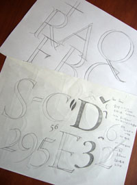
First of all, Akira Kobayashi talked about his projects that he worked with Hermann Zapf and Adrian Frutiger, and the type conference such TypeCon and AtypI. And then he explained about his workshop at AtypI St. Petersburg. He demonstrated how to draw alphabet letters by brush and the Double pencil method to understand what the natural letter form looks like, which was the same way he did in his workshop. We learned how to draw the Roman capital letters with double pencils. He said this method was the same way Europian design colleges did.
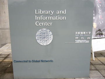
(Left)Signage in Kyoto Seika Univ. and the letter I draw with the double pencil method.(Right)
And Second, Masao Takaoka, is owner of Kazui Press, which is the most famous letter press in Japan, explained about Corporate Type. He explained about the Suntory Project, which is the first case for Corporate Type in Japan. Suntory is a beverage and alcohol maker.
Torinoumi explained about the digitize letter project for Shiseido, is cosmetics maker in Japan. That was very interesting story. Shiseido has an exclusive typeface for its advertising. According to Torinoumi, designers who join Shiseido company need to learn how to draw the exclusive typeface by hand at first. However, there are only two master designers who can teach newbie the way of lettering. Both of veterans will have to retire soon. So, Shseido decided to record the letter forms so that newbie will be able to reference letter forms whenever they want. Then, Shiseido asked Jiyu-kobo to digitize its letter forms.
Jiyu-Kobo started the project with two veterans. Jiyu-kobo digitized the letter and asked veterans to check the data. Both of veterans pointed out the same place, but the opinions how it should be revised were a little difference each other. Jiyu-Kobo often confused which opinion we should take. They repeated to check again and again. It took a lot of time to confirm the letter forms one by one.
After digitizing all letters, Jiyu-Kobo suggested making an “exclusive font” but Shiseido denied. “Shiseido told me that” Torinoumi said. “We don’t need a font. We know it’s easy to get the letter forms and to set letters using font, but we think it’s important that designers draw letters to know its forms and to hand down them to the following generations.” Torinoumi explained.
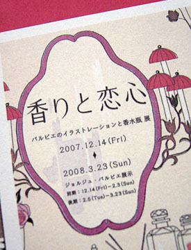
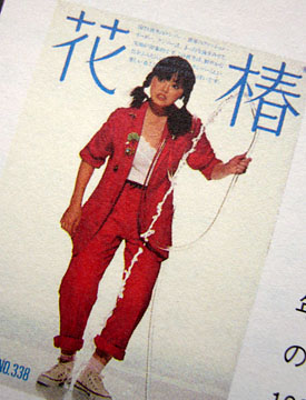
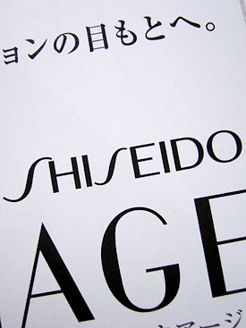
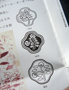
Picked Shiseido typeface up from the magazines and catalogues Shiseido issued. These are not the same one Jiyu-Kobo finalized but you can see what the Shiseido typeface looks like.
(Top Left) Shiseido letters in its advertising. (Top Right) Logotype for the magazine titled Hanatsubaki 花椿 literally “Flower of Camellia”, Shiseido used to issue for sales promotion. (Bottom Left) Shiseido company logotype. (Bottom Right) Shiseido symbolmark called Hanatsubaki. Shiseido uses the bottom one now.
Shiseido typeface has really unique letter forms. These forms reminds me of Japan’s old days. Shiseido kept the letter forms for over eighty years. “These letter forms were very funny, but elegant,” Torinoumi said, looking back the project.
At last, Kobayashi hinted that the one of Corporate Type projects will out in 2010. “I’m going to be busy to make fonts from the beginning of next year” he continued. After the Suntory project, there was no Corporate Type project in Japan. So I’m looking forward to seeing which company will out it and what the font looks like.
