Visiting the show room of Shueitai typeface.
Friday, September 12th, 2008I got a chance to see the show room that introduced Shueitai 秀英体, is the one of originate of Japanese typeface designs and exclusive typeface design for Dai Nippon Printing Co. 大日本印刷 abbreviated DNP. Shueitai was named after the Shueisha 秀英舎 which was the predecessor company to DNP established over 130 years ago.
I got together with two type designers, the one was Naoyuki Takeshita, who was former type designer of Morisawa, related article is here and here, and the other was Yutka Ozawa, who was former type designer of Adobe Japan, at JR Gotanda station, was near the Gotanda branch of DNP, Shinagawa Ward, Tokyo. Masaki Itou and Ai Sasaki, are the staffs of Shueitai project team, invited us to show the show room. Unfortunately, it was not in public.
After check-in the entrance, and then waiting for a while, Itou came and take us to the show room on the second floor. I was astonished the show room was really beautiful. The glass-walled room and white display cases are really cool and modern interior style, which had several kinds of unique gizmos. Some LSD displays show the demo animation introducing Shueitai.
Then, Itou started introducing the history of Shueitai and he explained the three generations of the media of the hot metals, photo type and digital watching composition with three medias and demonstration movie that showed by LCD monitor. Takeshita and Ozawa asked a lot of geeky questions to Itou, but he answered everything clearly and made us sure the detail. I enjoyed their dialogs because I could get information that I’ve never known. ‘I need at least two hours to talk about this presentation booth,’ Itou said with smile. It sounded like a joke but I thought he seemed to be serious and felt like talking about it. I believed he was the last person to introduce about Shueitai, as he had remarkable ability for Shueitai. They really love to talk about Shueitai.
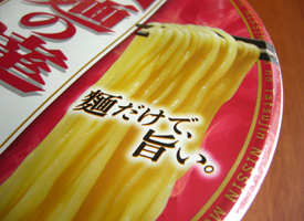
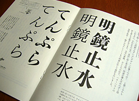
Left: In-use example of Shueitai Shogou for a packge of ramen noodles. I think Shueitai is very useful for the food package, especially Japanese foods. Right: The leaflet of the Shueitai revival project. The lovely duo mascot named Katsujii and Tombo-chan introduce about Shueitai.
The room in the end corner displayed a lots of stuffs for the letter press printings and some old Shueitai specimen books that DNP used to use . The show case had some drawer cases. Visitors can open them one by one. The most interesting device was the digital archive finder for transition of Shueitai letter forms. The archive showed the transition along with the time line. I could see the Shueitai has been changing its letter forms gradually. ‘However, the skeleton of the Shueitai has never been changing.’ Itou said.
After seeing the show room, Itou showed the design of Shueitai which was going on revising. DNP is going on the project called Heisei no dai kaikoku 平成の大改刻, means The revival project for Shueitai in Heisei period, to revise all of the Shueitai family includes three styles, Ming-cho, Gothic: Sans-serif and Maru Gothic: Rounded. Itou showed us the design that had been drawn before. He also showed some candidate Latin alphabet fonts for Shueitai fonts. ‘It was very difficult to choose the Latin font that suited with Shueitai fonts,’ he said, showing some specimen sheets of the candidate Latin fonts that composed with Shueitai fonts.
DNP announced that Shueitai fonts will out from the beginning of fiscal 2008 year, but the plans seemed to be delayed and the release date is not clear yet. Of course, I’ll show the Shueitai fonts for sure if they were out.
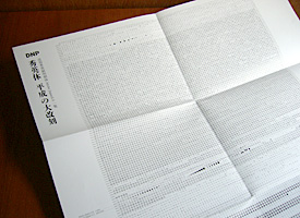
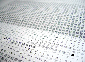
The Shueitai specimen poster contains all characters of Adobe Japan1-5. Sasaki told me that ‘You should put it on the wall of toilet in order that you can memorize where every character is while you are in the toilet every day.’


