Archive for May, 2008

A coffee meeting with Ian Lynam

Saturday, May 31st, 2008

15:07 p.m. In front of the JR Shinjuku station, the East ticket gate. Ian didn’t come yet. The time we promised to meet was already passed. I called him. I thought this was the first time I called a native English speaker. “Hi! where are you now?” He seemed to wait at the Central East ticket gate. I thought my explanation might have been wrong to tell him where the meeting place was. And then, I found he was coming toward me.

Ian and I kept in touch with each other since we met last meeting, but we didn’ t have enough time to meet together due to our hard schedule, so we couldn’t arrange the meeting for a while. I’ve been wondering whether the meeting was held for sure, but we decided the meeting day at last! As I thought it was a rare chance to meet with an interesting type guy, I decided I would take my friends, Yutaka Ozawa, who started solo project for Japanese font recently, and Akira Yoshino, who worked for a famous publisher in Japan and is also a moderator on MyFonts com forum, together.

After giving self introduction, we shared each other’s works. First, Ozawa-san showed his East-Asian style Calligraphy works, he also do Western Calligraphy though, and he showed his new type design in progress. Second, I showed Ian my portfolio included my package designs, logo designs and digital type faces that I’m going on. Ian seemed to be interested in my works, so he told me some opinion and asked some questions. And at last Yoshino presented some novels he worked for to Ian.

Ian asked Ozawa some questions about Ozawa’s Calligraphy works and also asked a question to Yoshino about the letter space for Japanese punctuations cited the mystery novel Yoshino brought. Ian often used Japanese text for his works, so he seemed to be interested in Japanese fonts and typography. Ian asked us some questions from Western style point of view. He pointed out Japanese custom. He seemed to be curious the difference between Japanese and Latin text.

I felt silly that I couldn’t explain fluently about my works in English. There seem to be some type guys in Japan who comes from overseas, so I would like to communicate with them. I’ll try to get a chance and plan a meeting at some point.

Thank you for coming in spite of a rainy day, Ian. I hope we’ll meet again soon.

P.S.
He also wrote this meeting on this blog “Viewers Like You”. Thakns, Ian!
TypeCon 2007 Typecrit video

Friday, May 23rd, 2008

I went to attend TypeCon Seattle 2007 last year. This was the first time for me to go a type conference was held on overseas. I got a chance to take type critique named “Ten minutes type critique” known as a regular event on TypeCon. Now you can find the audio and specimens on the critique that was held on TypeCon Seattle 2007 on YouTube.

TypeCon Seattle 2007: Typecrit 1 of 4

I recorded everything so that I could listen them after I’d back to home, because I didn’t think I could listen everything due to lack of my English skills,

Eben Sorkin, was one of designers joined 10 minutes critique, asked me to get the audio and he proposed we should provide this audio to every one who was curious about this event. And then, he compiled several photos, specimens, and movies to edit this audio and uploaded to YouTube.

The 10 minutes type critique is a regular event of TypeCon. Three critics provide their opinions to the attendees watching submitted type designs. Matthew Carter, John Dawner, and Akira Kobayashi were the critics at that time. Every attendee have 10 minutes only. They explained their concept and asked critics several questions within 10 minutes. The audience also asked their question about attendees works.

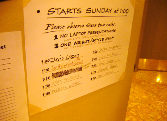
photo:The member list of 10 minutes type critique on the wall of front desk.
I wrote my name third place after someone quit to attend. Great!

This critique was very useful and helpful learning designing typeface. Not only I got several opinions from three critics but also it was useful to hear the opinions to the other designers.
I could understand easily where he important point was or how I should compare with the difference in the element. I’m pretty sure it is worth listening.

I couldn’t believe some famous type designers attended this type crit. Gabriel Meave, who is a really gifted type designer, attended this crit to show his font “Darka”, as you know, got the TDC prize. I though he didn’t need to join this crit because he could do everything! The other two Mexican type designers were also talented. AtypI conference will be held in Mexico City in next year. I guess type design in Mexico must be better to improve drastically.

At the farewell party of TypeCon Seattle, Mr. Dawner told me I should bring my revised type design to Buffalo. Thanks, Mr. Dawner!

P.S.
Related thread on Typophile.
TypeCon 2007 Typecrit video

Parallel Strokes

Thursday, May 15th, 2008

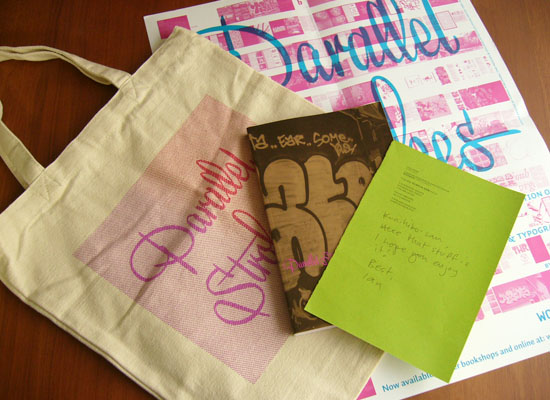
Ian Lynam, who I met at the meeting with Christian Schwartz last month, send me his book titled Parallel Strokes. I just said hello to him before leaving the meeting, so I emailed him and got an appointment to talk about topic on type design with him. Ian interviewed with Akira Kobayashi of Linotype for PingMag a few years ago. I’m aware of who the interviewer is since I read that interview. I didn’t think he lives in Japan.

Ian compiled 19 interviews in Parallel Strokes, which includes various type designers and graffiti artists. I enjoyed to know there were various background stories how they started type designs and typographic graffiti at first. Some part of the interview with Akira Kobayashi on PingMag seemed to be edited in order to fit the page, but a lot of photos and some sketches were added in Parallel Strokes. Interviews with Underware and DIAM were also included in it. DIAM is one of my favorite artists since I read the interview article that Ian did for the FontShop magazine a few years ago.


Ian send me his book “Parralel Strokes” and some novelty goods


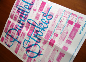
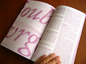
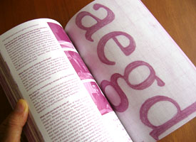
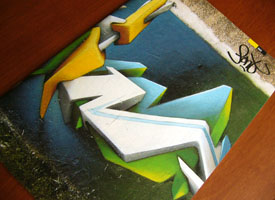
(Left above) Parallel Strokes Poster (Lower right) The DIAM’s photos in
Parallel Strokes reminded me of The FontShop catalogue Issue 005.

Ian is not only a graphic dsigner but also a type designer. He digitized Cooper Black Italic Swash. And he also have his label WordShape.