TDC exhibition 2008 opened at ggg gallery

April 12th, 2008

Tokyo Type Directors Club (TDC) exhibition 2008 started on April 4, 2008 at ggg gallery in Ginza, Tokyo. There are many unique and interesting typography works and type designs contained TDC prize award winning works. Especially, award winning TDC prize Latin typeface design Frida, which was designed by Fernando De Mello Vargas who was a student of Reading type design course in UK, was very interesting multi lingual font. Frida supports Latin and Tamil scripts. I met Fernando at the party after the Christian Schwartz’s presentation in 5tanda-sonic, see previous article, but I didn’t have enough time to chat with him, so I emailed him.

And Jiyu Kobo, is one of the most remarkable type foundries in Japan and also known for making Hiragino family bundled on MacOSX, got the TDC prize for Japanese fonts series it made.

This exhibition continued through April 26(Sat.) and will be also held at ddd gallery in Osaka Dojima from June 13(Fri.) to July 23(Wed.), 2008.
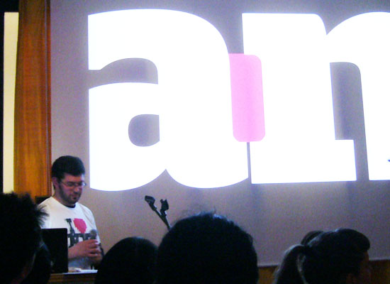
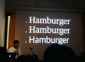
TAB Talks #4 with a N.Y. based type designer Christian Schwartz.

April 8th, 2008

I didn’t think that I could meet him in Japan. Christian Schwartz, based in New York, held a talk show at 5tanda Sonic event space in Gotanda, Shinagawa Ward, Tokyo . There was huge audience to see his show in spite of hard rain.

Wearing a lovely “I love N.Y.” T-shirt, he started to show some customized fonts for some major companies like Esquire, Deutsche Bahn (the German national railway company) and the Guardian, and explained the background stories of these customized fonts using a lot of specimens.

One of them, a typeface called Haçienda was developed for the Guardian, which is a famous news paper in UK. Haçienda, eventually renamed it Guardian, had a dynamic family more than 100 styles covered wide range weights and several kinds of styles like Serif, Sans and Slab styles, which would be released by the end of this year. Christian told us a full story of the design process from beginning to end.

After the show, I met him to ask some questions about his works, and I showed him my portfolio to get some opinions. He seemed to be interested in my heavy weight style fonts and told me some opinions. Thanks for the opportunity to meet with you, Christian!

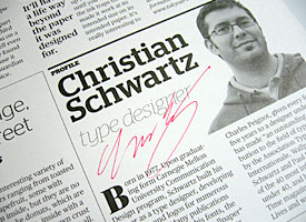
(Left) Christian explained the difference among three styles of Hacienda. (Right) A brochure for the audience of this presentation and a Christian’s autograph on it.

And I must say thank you to Chris Palmieri of AQ design studio. He was a coordinator to hold Christian’s presentation in Tokyo. He was very familiar with Latin typefaces and had some interviews with type designers that he was interested in such as Jeremy Tankard, which was on AQ’s web site. He helped me out a lot to have communicate with Christian. He was a very nice guy and really kind to me.

Christian’s presentation was held again at Robundo inc., a well-known publisher on typography in Japan, in Shinjuku Ward, Tokyo, before his leaving from Japan due to a request by a member of Society of Typography in Japan.

Kazui Press relaunched its web site

April 5th, 2008

The Kazui Press, which is the most famous letterpress house, especially Latin composition, in Japan, relaunched its website at the beginning of April. For the renewal of the website, several specimens of the hot metals they had were added to it, so you can see specimens on not only several classic and traditional typefaces, but also ornaments and wood types with the photos of hot metals for letterpress.

The second case, AXIS Font for railway signage

April 3rd, 2008

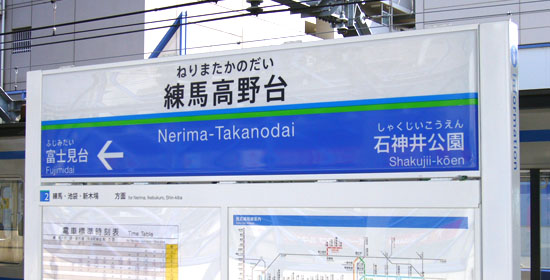
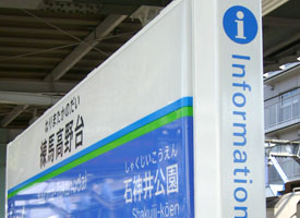
Seibu Railway, which runs through in northwest Tokyo and Saitama Prefecture, started new signange systems using AXIS font as a main font to change its sign boards.

The brilliant blue color of the sign board looks good and very striking, but I was wondering whether the commuters have been aware of this replacement. When I saw the new design sign board at Nerima-Takanodai station of the Ikebukulo line, located near my office, for the frst time, I couldn’t see at a glance that was AXIS font because I didn’t have enough skills to find out the difference of Kanji characters among the other Japanese Fonts. However, I could tell the Hiragana “た” as I knew well the characteristic Kana forms of AXIS.

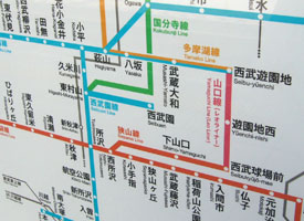
Regular weight was used for the signboard letters and Latin parts are Helvetica. The route map on the sign board is also the same. The old sign boards seem to be replaced by the new design, which is in progress now.

AFAIK, this is the second case AXIS is in use for a railway signage. The first one is Hisatsu Orange Railway in Kumamoto and Kagoshima pref., which started new sign boards that were designed by an architect Yasuyuki Kawanishi in 2004.

Shotype.com launched.

April 1st, 2008

I started my design office and my blog today. I’ve been thinking about that I try to introduce situation on type design and typography in Japan, because there seemed to be nothing English language web site concerning Japanese type design.

Although I didn’t know which is the best tool for my blog, I set up WordPress for a starter. I have a lot of work on my plate to revise this site, but I wanted to start this at April 1st so that I could excuse that it was April fool if I would not continue to post topics to this blog.

I have to say I’m not good at English, so I need to excuse my English skills in advance. I would appreciated if you had find out my mistake and let me know about it. Any suggestion and comment would be appreciated. Thanks!