The second case, AXIS Font for railway signage
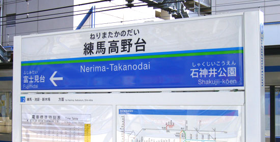
Thursday, April 3rd, 2008Seibu Railway, which runs through in northwest Tokyo and Saitama Prefecture, started new signange systems using AXIS font as a main font to change its sign boards.
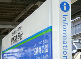
The brilliant blue color of the sign board looks good and very striking, but I was wondering whether the commuters have been aware of this replacement. When I saw the new design sign board at Nerima-Takanodai station of the Ikebukulo line, located near my office, for the frst time, I couldn’t see at a glance that was AXIS font because I didn’t have enough skills to find out the difference of Kanji characters among the other Japanese Fonts. However, I could tell the Hiragana “た” as I knew well the characteristic Kana forms of AXIS.
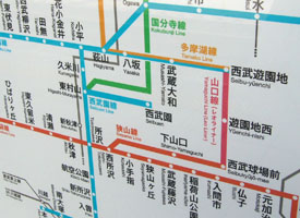
Regular weight was used for the signboard letters and Latin parts are Helvetica. The route map on the sign board is also the same. The old sign boards seem to be replaced by the new design, which is in progress now.
AFAIK, this is the second case AXIS is in use for a railway signage. The first one is Hisatsu Orange Railway in Kumamoto and Kagoshima pref., which started new sign boards that were designed by an architect Yasuyuki Kawanishi in 2004.


