Archive for June, 2008

The exhibition Yasufumi Miyake ‘Moji wa Ikiteiru’

Saturday, June 28th, 2008

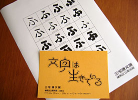
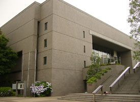
A typeface designer Yasuyuki Miyake’s personal exhibition titled Moji wa Ikiteiru 文字は生きている, means ‘The living letters’ was held at Nerima Art Museum in Nerima Ward, Tokyo. This exhibition had two parts. The one was themed Letter Design and the other was Letter Art.

He designed a lot of Japanese typefaces for more than fifty years, which were displayed in Letter Design room and showed 10 new typefaces as well. The famous round edged san-serif typeface family Jun from Morisawa Library and JTC Win family from Nis Library were also included. The large letters on the presentation boards were hand-trimmed black papers. He seemed to think it was important to draw letters by hand. And he showed some lettering works that designed names of sports athletes, entertainers and famous persons for several kind of magazines.

Meanwhile, there were a lot of print art works, which seemed to be silk-screen printings, in the Letter Art room. He dipicted several sceneries with Kanji letters 風 (wind), 雷 (thunder) and Kanji letters known as a symbol of nature. These letters were dynamic as if letters were alive and they were very unique and had humor feelings. I could find the difference between these two parts ‘static and dynamic.’

Left: The post card on the exhibition and Specimen sheet were provided at the gallery. Right: Nerima Art Museum.
The exhibition ‘Calligraphers Guild’

Sunday, June 22nd, 2008

In Japan, speaking Calligrapher, it might remind you of Japanese style Calligraphers. However, even in Japan, there are many Western style Calligraphers.

The exhibition titled The works of Calligraphers Guild was held at Gallery Kubota in Chuo Ward, near the Tokyo station. More than 200 works got together and were displayed in four rooms. There were several styles of expressions such as classic, modern, relief and a mixture work Japanese and Western styles.

One of Calligraphers I would like to see, Izumi Shiratani showed a beautiful work. Her work was really great and had gorgeous drawing lines. I’ve been acquainted with her since I met her at some party a few years ago, so I asked her to meet there in order to ask some questions about her recent work and activity.

I also asked her opinion about designing letters. I told her that I would need a Calligraphic style Logotype for package design, so I’ve been looking for a Calligrapher to draw letters for a logotype. I would like to know her opinion about whether Calligrapher would like to have opportunity to design logotype or not, or she can get the offer if I asked her. We exchanged opinions what the difference among art work and design work is, what problems are to design logo work, what art director should do for Calligrapher when they work together. She made me clear there’s nothing to worry about. I’m glad to hear that and I would like to work with Calligraphers to make Logotypes in the future.

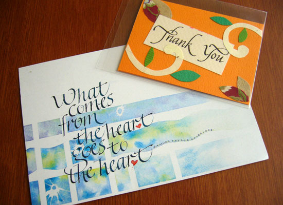
The direct mail and Thank you card for this exhibition.

This exhibition goes around to Sendai, Okayama, Osaka.

ICOCA Card with typeface “Take”

Friday, June 20th, 2008

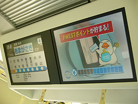
I had a few chances to get back to Kansai where my home town is in the past few days. I used to get on Hankyu Railway while I’d been in Hyogo pref., but now it is better to use JR West line for me because of easily access if I’ve got on Shinkansen, is the bullet train in Japan, when I get back to my home town from Tokyo. I always enjoy to watch the information display, which ran some commercials and information, on the ceiling inside a car.


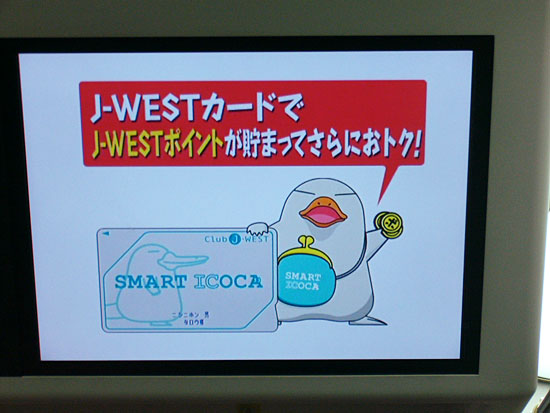
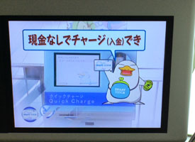
I found a unique commercial for ICOCA card, is a prepaid card for JR West. A unique platypus character, named “Ico-chan”, introduced ICOCA card to the commuter how useful it was. Ico-chan explained about the ICOCA card with call-outs and subtitles. The subtitles used typeface “Take”, which means “bamboo”. “Take” has really unique straight strokes, but the skeleton is not stiff and really natural to my eyes. “Take” have Japanese taste and casual feelings so I would like to use it for package designs such as for Japanese snack foods or tea.

The typeface “Take” won the silver prize of Morisawa award 1993, which had been designed by him and was released as one of Morisawa Liblary last year. The Take’s type designer Mr. Naoyuki Takeshita knows typefaces well about not only Japanese font also Latin typefaces, he taught me what the typeface was immediately when he and I hanged around downtown together. He has his blog and posted several photos on Japanese typefaces which he found in downtown where he hanged around. Called “街でみかけた書体: Machi de mikaketa Shotai”, means the typeface which he found in downtown, is really interesting blog post. It was a pity it is Japanese language only, but you can see several kind of Japanese typefaces on the blog.

Type design in China

Thursday, June 12th, 2008

I found the results on the 4th Founder Award Competition in Chinese type design from Jongseong’s blog post on Typophile.

Mr. Akira Kobayashi of Linotype joined this competition as a jury last year, and he introduced it on his blog. Since I’d read it, I’ve been looking for the results of the competition.

The resultc of The 4TH “Founder Award” Competition on Chinese font Design and Poster Design (MS Word Document.)

The outline of the competition in English
The 4TH “Founder Award” Competition on Chinese font Design and Poster Design

I was surprised that some of winning designs have gray tone! It reminds me of a Sumi-e, means Ink-and-wash painting. Usually, we should design letters without gray scale tone for digital fonts, but if these design could be used for Flash movies or on monitors, designing letters without gray tone might be nonsense. I thought these strokes with ink bleed and blur seemed to express time goes by. Indeed, we can use gray scale or color to make fonts using BitFonter.

You can also see the results of the past three competitions.

I’m always thinking about how I should design Latin characters that goes with Japanese characters. I enjoyed to think about how I should design Latin characters which goes with these winning designs.

In fact, I don’t know well the situation on Type design in neighboring countries China and Korea, but I think I should introduce type designs in Asian countries like type designers in Arabic countries drastically introduce Arabic fonts to the other countries. Japanese people also use kanji characters but there are slightly different with the ones in China. I know most of people who check this blog might hardly use CJK fonts, but I hope I’ll be able to show you a topic on CJK fonts and typography.

Recommend articles.
Seibundo Shinkosha Co., Ltd. 誠文堂新光社
IDEA magazine 307: Graphic Design in Korea
IDEA magazine 307: “Book Design in China” “Study on the Historical Development of Graphic Design and Typography in China 1805-1949 Text: Sun Mingyuan.”