Torinoumi gave a presentation at UD publishing collegium.
Saturday, July 25th, 2009The talk show began with showing a photo taken Mt. Chokaizan volcano, located on the border Yamagata and Akita Prefecture in Tohoku Region, the Northern part of Japan. Snow on the top of the mountain is brilliant and beautiful, rice fields spread around the foot of the mountain, beautiful rivers run through the field. This place is known as the location of the Academy Award winner movie Departures. Torinoumi was born and raised there.
Osamu Torinoumi is the head of Jiyukobo Inc. (字游工房), is known for designing Hiragino font family bandled on Mac OSX. After working for Shaken, was the biggest photo-type setting machine maker in Japan, as a type designer, he was the one of two co-founders of Jiyukobo under ex-boss Tsutomu Suzuki, was founder of Jiyukobo and passed away in 1996, and now leads the office.
When Torinoumi was a student of Tama Art University, he visited Mainichi Shinbun Co., Ltd., (The Mainichi Newspapers), to see a workplace for making typeface for its newspapers. Torinoumi decided to become a type designer by the word from Masahiko Kozuka, a type designer giant in Japan and worked for there at that time, that “For Japanese people, Letter is like rice and water.” He might remember the scene in his childhood.
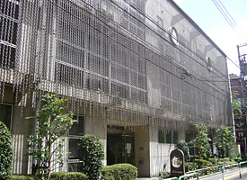
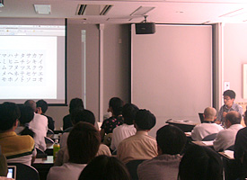
Left: The event was held at Japan Braille Library (日本点字図書館) in Takadanobaba, Shinjuku Ward, Tokyo. Right: The event room displayed the slides Torinoumi provided.
The talk show had three parts. First, Torinoumi introduced the history of Letter in China and Japan briefly, then talked about the issues titled “About the topic on the body text which make users feel annoyed.” He showed the tips for how to choose a proper Japanese typeface for body text comparing several kind of typefaces, for example, the balance of black and white, body size and the balance with the Latin alphabet. As for the balance of black and white, usually, Kanji letter becomes darker as its number of strokes is increasing. When setting all Kanji characters, you have to pay much attention to the contrast of the texture. If the contrast is high, it’s not good for a body text. The typefaces Jiyukobo made were really well-balanced and moderate texture. The references he showed were very clear to find the differences among the typefaces.
“I believe that typefaces for body text have played an essential role for developing Japanese culture after Meiji era. In order to provide the contents on the several kinds of medias such as books, comics or magazines, typefaces on these medias must have clearly showed its contents to readers, which means typefaces were a pillar part of Japanese culture,” Torinoumi said. “I hope to make a typeface which can be used for these medias for a long time,” he continued.
In addition that, he told us an interesting episode about typeface design. “I can say typeface has dignity because I know most of people think typeface has dignity,” he said looking back the presentation he gave before. “I asked the attendees whether you think Ishii Ming-cho from Shaken (well known for one of the excellent design) has dignity? then, ninety percent of them answered ‘yes’. I thought it meant typeface is able to have dignity. In order that typeface lives for a long time, it needs to have dignity, I thought we have to take care that point when we design fonts.”
Torinoumi also mentioned about the UD fonts (Universal Design font). UD font is becoming a hot topic in Japanese typeface market because of the design trend in Japan. Especially Product design field tends to design products with Universal Design philosophy. About the trend, “I hope you had better to take care where the UD fonts should be used. I don’t think the UD fonts are versatile. Some of UD fonts might be good for titles, signs or interfaces for electronic devices, but I don’t think they would work for body text of books or magazines,” Torinoumi said.
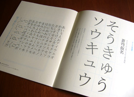
The second part was a presentation about the project making original Kana font for the printing company, Caps inc. The project started by the request from Caps Inc. for its exclusive use. Torinoumi made two sibling Kana fonts, the one named “Bunrei-Kana (文麗仮名)” is for Japanese literature, especially early-modern literature, the other named “Soukyu-Kana (蒼穹仮名)” is for translated foreign literature. Because the word came from overseas such as character’s name are expressed with Katakana in Japanese language. There are thousands of Katakana words in the sentences on Translated literature. Soukyu-Kana featured distinguished Katakanas compared with Bunrei-Kana.
Before starting to make letters, he read the book titled Kokoro by Soseki Natsume, the one of famous Japanese old literature, to develop design images. The story described character’s compassion, so Torinoumi wanted to make letters one-by-one with much compassion.
Usually, Torinoumi draws draft design with a lettering method. But in this project, he decided to challenge the way he never tried before. First, he drew the skeleton of letter on the 20 millimeter squared guide lined paper with pencil. Then he drew draft design with a brash with method of Calligraphy. By drawing letter with a brash at once, he thought the letter got natural forms featured specific brash movement. At that moment, he thought “I’m fabulous and no type designer who is able to draw such these excellent letters.” However he had to change his mind soon.
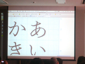
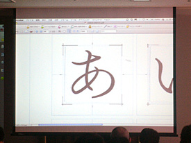
Left: The draft design on the drawing paper with 20mm-square guideline. Right: After enlarged them to 48mm square, then input them into PC.
After digitizing the draft letters as a prototype font, the result of the setting was really worse, which made him disappointed. The Kanas he had thought excellent were no good at all. Torinoumi analyzed the reason and found that the draft drawing based on brush handwriting was too close natural forms of Calligraphy. Typeface had to work not as Calligraphy but as a typeface. Having too much handwriting letter forms didn’t contribute to readability. Calligraphy method didn’t work to design Kana letters than he expected. He repeated to revise them, and the revision counted 13 times, which created sophisticated design and elegant forms.
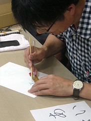
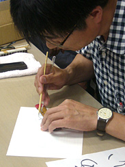
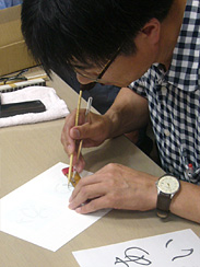
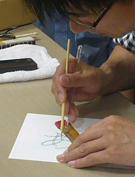
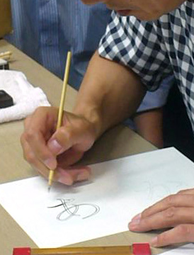
And at last, he demonstrated inking Bunrei-Kana letters with brush.
Above: Demonstration an inking letter technique for the draft drawing. No straight line in almost of Kanas. To keep the draw point head-on, he rotated the paper. He learned this method at Shaken Inc.
Left: Inking with a guide scale, Japanese Menso painting brush and Japanese ink. He inked the Kana with superb skills about 5 or 6 minutes per letter answering visitor’s questions. He rotated the guide scale along with the curve of the letter. Right: After drew outlines, filled inside. You can see a wonderful technique from here (Note: QuickTime Movie).
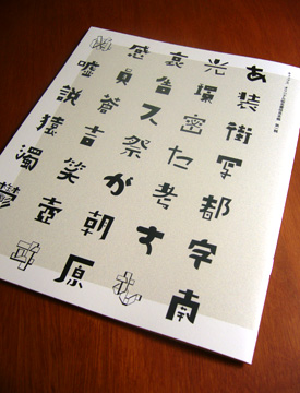
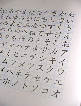
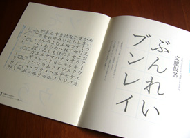
Left above: The specimen book of Bunrei and Soukyu that Caps Inc. provides. Right above: Bunrei-Kana. The consequence stroke form at the top of letter ”あ” in the draft sketch was erased.
Left bottom: ぶんれい Bunrei-Kana. Right bottom: そうきゅう Soukyu-Kana.
Related article: Type seminor in Kyoto
Related article on Jiyukobo Inc.: Talk show with two type designers, Kataoka & Okazawa.
