The Ice cream day.

May 9th, 2009

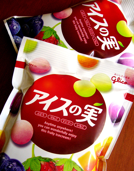
In Japan, today is the Ice cream day. I designed a logotype and a package for an Ice sorbet named “Ice no Mi: means Fruits of Ice”. It will become hot season soon, so I hope you buy it if you were in Japan! You can get this at the combini shops.

Creative Direction: Ezaki Glico Co., design division. Art Direction: Ing associates inc. Design: Shotype Design

Talk event, the exhibition Typeface found in Setagaya Ward, Tokyo.

January 18th, 2009

Do you know the name of typefaces that you can see in downtown?

A type designer Naoyuki Takeshita is a notable designer not only making his Japanese font named Take:竹, means bamboo which was named after an initial of his family name 竹下 Takeshita, was distributed by Morisawa, but also his blog titled Machide mikaketa Shotai, 街で見かけた書体 means ‘Typeface found in downtown’. He introduced a lots of typefaces and fonts which were on billboards, traffic signs or shop signs while he was hanging around downtown. He often posted photos on typefaces he found to his blog with a comment using a lot of humor. As he is a typeface designer for Japanese font, he knew almost of typefaces not only old hot metals and photo type setting but also the recent digital fonts, so he can tell what the name of the typeface quickly.

Takeshita’s exhibition titled Setagaya de mikaketa Shotai 世田谷で見かけた書体, means ‘Typeface found in Setagaya Ward, Tokyo’ was held at the Setagaya Culture Life Information Center. The project started last July by the request that Hasegawa, was the organizer of this exhibition, asked Takeshita for searching typeface in Setagaya, because Hasegawa was interested in Takshita’s blog and wanted to held the exhibition. The project has been started last August, then Takeshita came to Setagaya several times to take photos. The exhibition was compiled by the best selection. As a pre-event, he also started a blog titled Setagaya de mikaketa Shotai 世田谷で見かけた書体 from the beginning of last December, he continued to post some photos and comments in the same way he had done on his blog before until the end of last year.

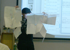
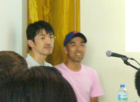
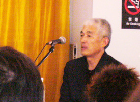
Left: Takeshta talked about this project. Right: Hasegawa showed the map that they used while the research. The map was almost tattered because of overused.

The talk event had two parts, the first, Takeshita showed the typefaces which he had seen in Setagaya by category, billboard sign, traffic sign, railway sign and public sign. He introduced the typeface we don’t know, and signs we usually don’t take care about, such as a mark on the road called Doukai, 道界 which indicates boundaries to divide properties.

The second, he picked up the things which he was interested in, non-typeface letters such as logotype and hand writing letters, and introduced the food shop or restaurants he had take a lunch while he walk through downtown. ‘One of funs when I researched downtown was looking for a nice restaurant or a food which are famous in Setagaya,’ Takeshita said. ‘I didn’t search any restaurant in advance at all, I decided the shop for a lunch after coming to the research place. ‘If I found a nice billboard or facade, I tried to enter the shop and had a lunch’, he continued.

‘I found the main purpose of this project was not knowing what kind of typefaces are in Setagaya but finding  characteristics of Setagaya by looking for typefaces’, Takeshita said looking back the research. So, I asked that ‘I’ve heard you had found a lots of typefaces on signs around Tokyo before this project started, did you find the difference among Setagaya Ward and the rest area where you had ever visited? Plus did you find the specific trend for typeface in Setagaya Ward?’ He answered that ‘As I mentioned, the main purpose of this project was to know about the specific trend in Setagaya, but it was a pity that I couldn’t find it, but I found different topic. I live in Saitama prefecture (northern neighboring Tokyo), so I could find the difference that each public region has own regulation way where the public signs should be placed.

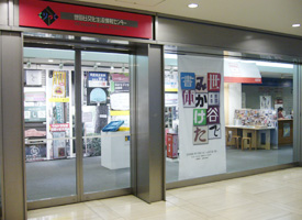
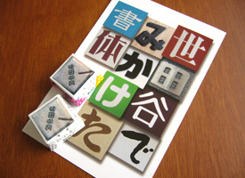
Left: The exhibition space. Right: The direct mail of the exhibition and the novelty chocolates that delivered to visitors. The chocolate imitated the mark on the road Doukai 道界.

According to Takeshita, some of who saw this exhibition wanted to see what is the situation about another district, as there are 22 wards in Metropolitan Tokyo except Setagaya. I thought it must be hard work for Takeshita. I knew he spend a lot of time to finish this project. It was not easy work at all. However, I also know he can’t stop looking for typeface in downtown, he must be going to start another project soon because he is always searching typefaces and fonts everyday. I hope he will plan another project which features area he will be interested in.

Related topic.
ICOCA Card with typeface “Take”

AXIS Compressed has released.

January 16th, 2009

The rest family fonts of AXIS compact series, AXIS Compressed fonts were finally released on Wednesday, Type Project inc., which is the foundry of Axis font, announced on its press release. AFAIK, no true compressed Japanese digital font for retail has ever seen before in Japan. AXIS compact series, includes AXIS Condensed, already got the Good Design Award in Communication category in 2008.

Some of famous global companies, Apple Japan, Mazda, Wii by Nintendo, have been using AXIS font Basic family, has squared width, for their commercial applications, web sites and TV commercials. And at the end of last year, NTT Docomo also started using AXIS font for its mobile phone devices as a system font. Now, AXIS font could be used for the devices made by Sharp only, but NTT Docomo announced that all of the future Docomo devices will have the AXIS font.

You can download trial fonts of AXIS font family from Type Project site. You need to put your info, includes your name, your address, OS version you are using, to the submit page’s dialog boxes that marked red color. I recommend you use Google translate, if you had been stuck to input them. After submit your info, Type Project will return info mail to your address, which includes the link for the trial fonts. The trial fonts include about 1,000 Kanji characters, Joyo-Kanji only, but it is available Latin alphabet part, Hiragana, Katakana and sign symbols. You will be able to see what the fonts look like. Of course, the regular fonts for retail are available over 7,000 Kanji characters, Adobe-Japan1-3.

Type Project relaunched its web site. And AXIS inc., is the exclusive dealer for AXIS fonts, also relaunched www.axisfont.com and indicated the Latin family of AXIS font, includes Italic family, will be available soon.

A happy new year 2009.

January 16th, 2009

A belated happy new year! I can’t believe that half a month has already passed. I couldn’t anything I had to finish at all. I hope to upgrade this site, but I fail to do it again this year, unless I will make a schedule for sure.

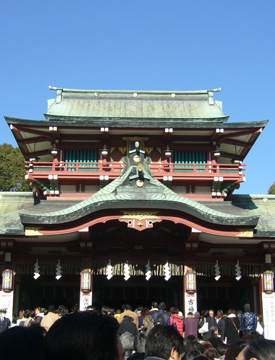
To accomplish my goal, I went New Year’s visit to Tomioka Hachimangu shrine 富岡八幡宮 in Koto Ward, Tokyo. I wished for everything would get better. I am also looking forward to seeing what happen to type design world in this year and I hope to meet with new people who is interested in type design.

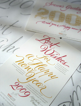
Left: Tomioka Hachiman shrine. Right: New year’s cards for my design office.

Type seminor in Kyoto

October 24th, 2008

Eizan railway, the one-man operating train has two cars runs through northern Kyoto city, which left the terminal station named Demachiyanagi in northern Kyoto city. It was a retro-car that had woody interior when I got on this train about fifteen years ago, but it seemed to be updated into the state of the art cars that had wide view windows. After getting on the train for about twenty minutes, the train arrived at the Kyoto Seika Univ. station. I came to this college several times while I was a student of Kyoto City Univ. of Art about sixteen years ago, but the looking had completely changed.

I looked for the class room the lecture would be held and found it but there were only three persons in the room. After a while, the chime rang and then a bunch of students came into the room.

I wanted to see this lecture because not only Akira Kobayashi would give a presentation but also the lecture would deal a program on Corporate Type. Besides, Osamu Torinoumi would show the presentation. Torinoumi is a type designer for Japanese font and General manager of Jiyu-Kobo, which is one of famous type foundries in Japan and designed Hiragino series bundled in MacOSX. I’d never hear his talking, so I was looking forward to seeing his presentation.

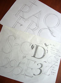
First of all, Akira Kobayashi talked about his projects that he worked with Hermann Zapf and Adrian Frutiger, and the type conference such TypeCon and AtypI. And then he explained about his workshop at AtypI St. Petersburg. He demonstrated how to draw alphabet letters by brush and the Double pencil method to understand what the natural letter form looks like, which was the same way he did in his workshop. We learned how to draw the Roman capital letters with double pencils. He said this method was the same way Europian design colleges did.

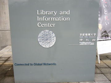
(Left)Signage in Kyoto Seika Univ. and the letter I draw with the double pencil method.(Right)

And Second, Masao Takaoka, is owner of Kazui Press, which is the most famous letter press in Japan, explained about Corporate Type. He explained about the Suntory Project, which is the first case for Corporate Type in Japan. Suntory is a beverage and alcohol maker.

Torinoumi explained about the digitize letter project for Shiseido, is cosmetics maker in Japan. That was very interesting story. Shiseido has an exclusive typeface for its advertising. According to Torinoumi, designers who join Shiseido company need to learn how to draw the exclusive typeface by hand at first. However, there are only two master designers who can teach newbie the way of lettering. Both of veterans will have to retire soon. So, Shseido decided to record the letter forms so that newbie will be able to reference letter forms whenever they want. Then, Shiseido asked Jiyu-kobo to digitize its letter forms.

Jiyu-Kobo started the project with two veterans. Jiyu-kobo digitized the letter and asked veterans to check the data. Both of veterans pointed out the same place, but the opinions how it should be revised were a little difference each other. Jiyu-Kobo often confused which opinion we should take. They repeated to check again and again. It took a lot of time to confirm the letter forms one by one.

After digitizing all letters, Jiyu-Kobo suggested making an “exclusive font” but Shiseido denied. “Shiseido told me that” Torinoumi said. “We don’t need a font. We know it’s easy to get the letter forms and to set letters using font, but we think it’s important that designers draw letters to know its forms and to hand down them to the following generations.” Torinoumi explained.


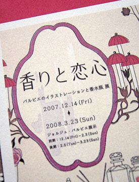
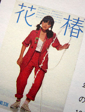
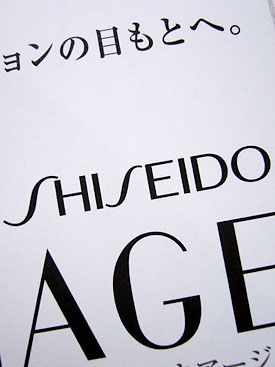
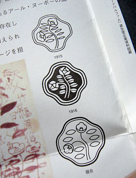
Picked Shiseido typeface up from the magazines and catalogues Shiseido issued. These are not the same one Jiyu-Kobo finalized but you can see what the Shiseido typeface looks like.
(Top Left) Shiseido letters in its advertising. (Top Right) Logotype for the magazine titled Hanatsubaki
花椿 literally “Flower of Camellia”, Shiseido used to issue for sales promotion. (Bottom Left) Shiseido company logotype. (Bottom Right) Shiseido symbolmark called Hanatsubaki. Shiseido uses the bottom one now.

Shiseido typeface has really unique letter forms. These forms reminds me of Japan’s old days. Shiseido kept the letter forms for over eighty years. “These letter forms were very funny, but elegant,” Torinoumi said, looking back the project.

At last, Kobayashi hinted that the one of Corporate Type projects will out in 2010. “I’m going to be busy to make fonts from the beginning of next year” he continued. After the Suntory project, there was no Corporate Type project in Japan. So I’m looking forward to seeing which company will out it and what the font looks like.

Visiting the show room of Shueitai typeface.

September 12th, 2008

I got a chance to see the show room that introduced Shueitai 秀英体, is the one of originate of Japanese typeface designs and exclusive typeface design for Dai Nippon Printing Co. 大日本印刷 abbreviated DNP. Shueitai was named after the Shueisha 秀英舎 which was the predecessor company to DNP established over 130 years ago.

I got together with two type designers, the one was Naoyuki Takeshita, who was former type designer of Morisawa, related article is here and here, and the other was Yutka Ozawa, who was former type designer of Adobe Japan, at JR Gotanda station, was near the Gotanda branch of DNP, Shinagawa Ward, Tokyo. Masaki Itou and Ai Sasaki, are the staffs of Shueitai project team, invited us to show the show room. Unfortunately, it was not in public.

After check-in the entrance, and then waiting for a while, Itou came and take us to the show room on the second floor. I was astonished the show room was really beautiful. The glass-walled room and white display cases are really cool and modern interior style, which had several kinds of unique gizmos. Some LSD displays show the demo animation introducing Shueitai.

Then, Itou started introducing the history of Shueitai and he explained the three generations of the media of the hot metals, photo type and digital watching composition with three medias and demonstration movie that showed by LCD monitor. Takeshita and Ozawa asked a lot of geeky questions to Itou, but he answered everything clearly and made us sure the detail. I enjoyed their dialogs because I could get information that I’ve never known. ‘I need at least two hours to talk about this presentation booth,’ Itou said with smile. It sounded like a joke but I thought he seemed to be serious and felt like talking about it. I believed he was the last person to introduce about Shueitai, as he had remarkable ability for Shueitai. They really love to talk about Shueitai.

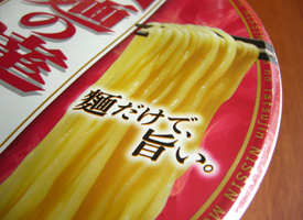
Left: In-use example of Shueitai Shogou for a packge of ramen noodles. I think Shueitai is very useful for the food package, especially Japanese foods. Right: The leaflet of the Shueitai revival project. The lovely duo mascot named Katsujii and Tombo-chan introduce about Shueitai.

The room in the end corner displayed a lots of stuffs for the letter press printings and some old Shueitai specimen books that DNP used to use . The show case had some drawer cases. Visitors can open them one by one. The most interesting device was the digital archive finder for transition of Shueitai letter forms. The archive showed the transition along with the time line. I could see the Shueitai has been changing its letter forms gradually. ‘However, the skeleton of the Shueitai has never been changing.’ Itou said.

After seeing the show room, Itou showed the design of Shueitai which was going on revising. DNP is going on the project called Heisei no dai kaikoku 平成の大改刻, means The revival project for Shueitai in Heisei period, to revise all of the Shueitai family includes three styles, Ming-cho, Gothic: Sans-serif and Maru Gothic: Rounded. Itou showed us the design that had been drawn before. He also showed some candidate Latin alphabet fonts for Shueitai fonts. ‘It was very difficult to choose the Latin font that suited with Shueitai fonts,’ he said, showing some specimen sheets of the candidate Latin fonts that composed with Shueitai fonts.

DNP announced that Shueitai fonts will out from the beginning of fiscal 2008 year, but the plans seemed to be delayed and the release date is not clear yet. Of course, I’ll show the Shueitai fonts for sure if they were out.

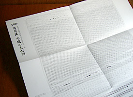
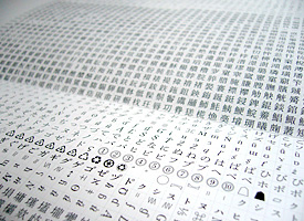
The Shueitai specimen poster contains all characters of Adobe Japan1-5. Sasaki told me that ‘You should put it on the wall of toilet in order that you can memorize where every character is while you are in the toilet every day.’

Talk show with two type designers, Kataoka & Okazawa.

August 8th, 2008

A really interesting talk show with two type designers for Japanese fonts was held at 5tanda sonic: pronounce gotanda sonic. Akira Kataoka, who designed unique Ming-cho style font named “Maru ming-cho: 丸明朝” and “Maruming old: 丸明オールド” , and Yoshihide Okazawa, who works for Jiyu-Kobo, which is one of the leading design companies for Japanese fonts and was famous that Jiyu-Kobo designed Hiragino family that bundled with MacOSX.

Maruming old is unique Ming-cho style font that have rounded edges and traditional skeleton, especially Hiraganas and Katakanas. There was no style like Maruming ever before, so a lot of designers welcomed to use it into their works. I think you might see Maruming old at least once a day in the posters everywhere you go and the commercial films while you see TV programs.

Left: Yoshihide Okazawa (Left). Right: Akira Kataoka

They started with looking back days when they started type design for the first time. Okazawa talked about his college days when he started to design letters. “Emigre and Neville Brody were hot in that days,” he mentioned. As he is my age, I had a lot of similar experience with him. I also started to design when I was college student using Fontographer 3.1 as I’ve got an impression of Emigre and Neville Brody. Okazawa finally made a Japanese typeface, using a function of Japanese word processor, which was able to make letters, for his graduation works. As I knew the way of making typeface using word processor was very hard and needed a lot of times, so it was hard to believe his story. If it was a true, I thought his energy for making fonts was enormous.

Kataoka also mentioned his old days and episode when he started to design letters for the first time. While he worked for a design office, he always wrote a lot of letters on presentation boards for a business show that the client would be held. And decades passed,the economy situation turned down around 90s, known as the collapse of the bubble economy. “I needed to have special skills so that I could survive the severe economic situation,” Kataoka said. He thought that he could draw letters and love to draw letters. “If I could make a font, I could have it as a property,” Kataoka continued.

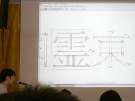
At the second part of the show, Okazawa demonstrated how to make Japanese digital fonts that Jiyu-kobo did using a software named “Bezier editor” from URW. According to Okazawa, Jiyu-Kobo usually begins with making basic reference characters for Kanji letters. They always draws two Kanji letters “国:country” and “東:east” to decide basic design for a starter. The reason they begin with these letters is that these two letters have several kind of characteristic elements for Kanji letters such as serifs, strokes, counters and body size. After that, they scan these images into the PC and traced them using Bezier editor. Then repeat this process for basic 12 letters as well.

The part of Kanji letters that they made before were available to share with the rest letters. For example, in case he wants to make the letter “明”, he assembled the left part of “昭” and the right part of “朝”. It must be revised to fit the space where the part should be, but it’s faster way than making all parts one by one.

I was astonished that he controlled bezier curves to fit the sketches very fast!! It took around only ten minutes per one letter. I was sure he had a lot of experience to control bezier curves. That’s why he did it very quickly.

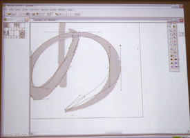
Then, he demonstrated how to design Hiragana letter “あ”, which is a phonetic character that we pronounce it “a”. “To make all parts of (more than 7000) Kanji letters, we just draw only few Kanji letters, on the other hand, we need to draw all (more than around 100) Kana letters to design them” Okazawa said. I guessed Hiragana and Katakana have a lot of gorgeous curves, so they need to draw all Kana letters in order to decide the design of Kana characters. The skills of drawing letters by hand must be faster than controlling bezier curves.

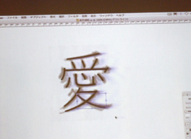
Left: The basic letters “国” and “東”. Jiyu-Kobo judges several kind of factor such as body size, counter, serif and weight by these basic letters. Right: Okazawa demonstrated how to trace the letter “あ”.

Meanwhile, Kataoka showed his method to design Kanji letters. “I think the skeleton of the letter is very important factor to design letters” Kataoka said. He usually gathered several style of typefaces that he was interested in, not only old and ancient ones but also the one his staff drew by hand. Then, he selected two completely different style of typefaces and overlapped them. He picked up overlapped image and traced it. I thought it was like a blending method. The letter that he traced overlapped image was completely different design compared with the typefaces he selected at first. According to Kataoka, the way of design of Maruming was the same method he demonstrated. I thought it was very unique method to design new one.

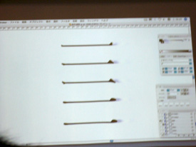
Left: Kataoka picked up a image by overlapping both of two different images. Right: The horizontally stroke elements for Kanji letters as a prototype.

I’ve already heard how to make Japanese font, but I’ve never seen the method directly like the way they introduce this time. I thought these were very interesting and I was happy to see live-actions. I was pretty sure these fascinated audiences.

The workshop of casting hot metals.

July 12th, 2008

Have you ever experienced casting hot metals, or do you know a process how to make hot metals?

I’d got a chance to join a workshop event casting hot metals. I happened to hit the information of the event while I looked for info on hot metals. The workshop was held by Tsukiji Katsuji, means Tsukiji hot metals, however, it has little to do with Tsukiji-tai: 築地体, located in Yokohama where is near from Tokyo about thirty minutes by train.
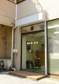
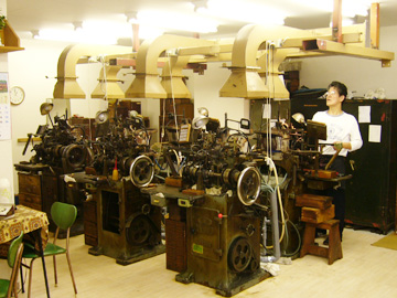
Left: The Tsukiji Katsuji. Right: Six casting machines in two lines.

I expected the building was like a factory but it was very clean like a show room for an interior furniture. I prepared a fatigue, but there seemed to be no worry about getting clothes dirty. The room had some shelfs and cases which stocked a thousands of hot metals and matrices, and on the left hand, six casting machines stood in two lines on the floor. The owner of the office, Mr. Hirakou let participants look around in the room and permitted to take photos until the time the workshop would start.

After all participants had arrived at the office, first, Mr. Hirakou started to explain the outline and history of the office. Second, a craft man of the office, Mr. Ohmatsu explained the process of casting hot metals and then demonstrated it.
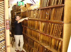
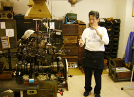
Left: Mr.Hirakou explained about the stock shelfs of hot metals and matrices. Right: Mr Ohmatsu, a craft man of casting metals, explained about how to casting metals.
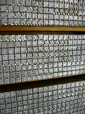
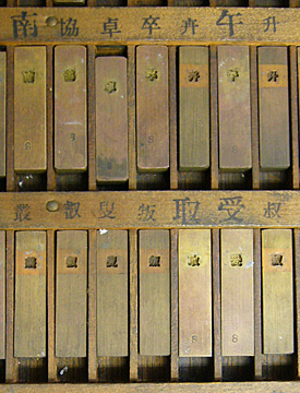
Left: A thausand of hot metals in the stock shelf. Right: Matrices in the box.
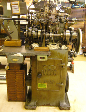
Left: The Hakko’s auto casting machine. Right: The machine had a change-speed mechanism with the belt harnessed the shaft which tapered right to left.
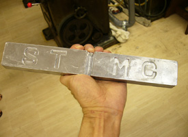
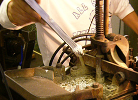
Left: The ingot made from lead, antimony and tin which came from mainly mainland China. Right: The dissolution temperature of the ingot was around 350-400 degrees. “It is very difficult to control setting temperature while summer season, because if it was not proper temper, the dissolved metal would stuck inside the machine,” Ohmatsu said. The room was sizzling. The ingot melted as soon as he put it into the machine.
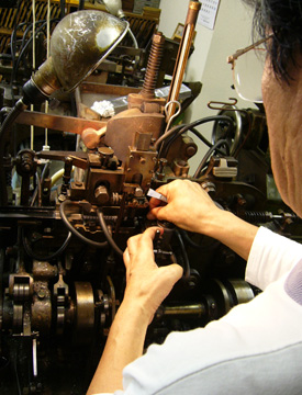
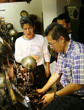
Left: Ohmatsu set the matrix to the machine. Right: All participants could cast the one of letters which was included in their own name. We need to set the matrix at proper position. I thought it was good position, but Ohmastu could tell at a glance that the position was wrong, and revised it immediately.
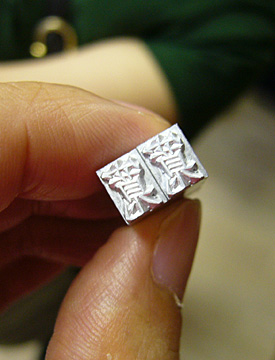
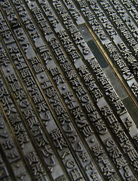
Left: The hot metal had just made. The metal was very hot, but Ohmatsu didn’t care to have it at all. Right: The composition in a galley for a specimen book of Tsukiji Katusji.

While Ohmatsu explained every process of casting, he told us some episodes when he was a pupil of the office. The customers often came to the office at midnight and asked staffs to get hot metals. So the shop staffs needed to stay there in twenty-four seven and 365days so that they provide types to customers whenever they wanted. That’s why, the staffs couldn’t go for a trip to anywhere for a long time. All his episodes he introduced us were very interesting.

At last of the workshop, one of participants, who had owned a printing house before, showed us some hot metals he had used, which included the one casted by the Linotype machine, a huge hot metal and the unique one, which had forty-nine letters within around one centimeter square, made by the Benton machine.

As I’m a digital font generation, I’d hardly used not only the hot metal printings but also photo type setting before. However, a magazine that features letter press and hot metals are increasing gradually. “So, designers who want to use a letter press are increasing now,” according to Hirakou.
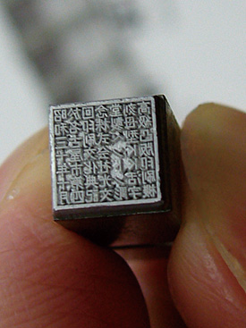
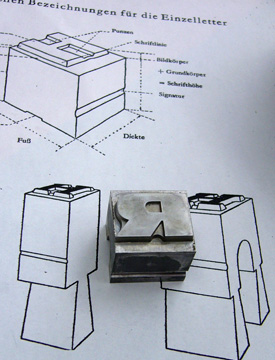
Left: A type smaller than fingertip had forty-nine letters included Kanji and Katakana within about one centimeter, which made by the Benton punch-cutting machine. It reads that ‘昭和三十年十月於名古屋市第四回印刷文化典記念株式会社光文堂製ベントン彫刻母型KK活字高級凸版印刷機’. Right: A huge type and its explanation sheet.
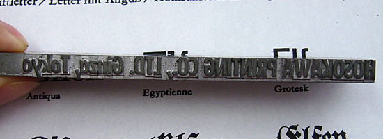
A line of type casted by Linotype machine.
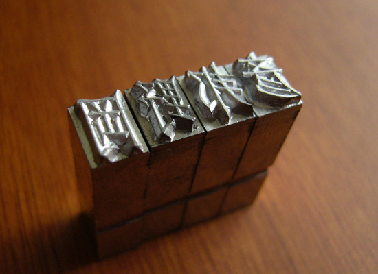
The types, reads 岡野邦彦 (Okano Kunihiko), is my name, which were presented by Tsukiji Katsuji. All participants could get types of their own name each.

The workshop seems to be held on an irregular base. I’m afraid that the workshop was in Japanese only, though.
The type designer giant, Kozuka talks about three generations of type design.

July 5th, 2008

As you know the type designer giant Adrian Frutiger, in Japan, there is also a type designer giant for Japanese font. Masahiko Kozuka, is 79 years old, who is famous for Adobe Kozuka family bundled with Adobe applications, gave a presentation about his works.

In an impressive monochrome photo Kozuka showed at the beginning of the talk show, a young lad was standing surrounded by a bunch of veterans, he seemed to be shy but to have enormous energy for making typeface. The photo was taken when he was a newbie worker for Mainichi Shinbun: Mainichi newspaper, is one of major newspaper companies in Japan, with its veterans. And then about fifty-years passed, he was standing in front of the audience who came to hear and talk to them looking back at his old days.

He had careers for three generations of making typeface, hot metals, photo type setting and digital fonts. He showed a lot of photos and important 8mm movie archives he owned and introduced how to making typeface of each of generations.

His career for making typeface started when he joined Mainichi Shinbun: Mainichi Newspapers Co., Ltd, around fifty years ago. He worked to make matrices for the newspaper typeface, now we call it “Mainichi Ming-cho”. And some decades passed, Morisawa, is a font vendor in Japan and known for holding Morisawa award, asked Kozuka to come to Morisawa as a advisory staff. While working for Mainichi, he also went to Morisawa corp. once every week. After retiring Mainichi, he completely moved to Morisawa. Then Morisawa started the Shin-Go:新ゴ project. To make Shin-Go family fast, which has five weights and every weight has more than 8,000 characters, Kozuka organized a font team and built a software for group sharing, which connected to the similar way which he used in Adobe to make Kozuka family.

He also had contributed to a developing country to develop letterpress system or to provide how to make typefaces, but the project often had to postponed due to war, civil war or conflict. “To improve making type face technology, it can be needed the world is peace,” Kozuka said. It was very impressive.

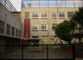
Left: The one of his best known works, Kozuka family by Adobe. He demonstrated how to make fonts using a customized software for making Japanese font by Adobe. Right: The facade of the event hall CCAA Art Plaza, which is an ex-elementary school in Shinjuku Ward, Tokyo.

Kozuka looked back at his life as saying that “I think one generation was about two decades, then closing up every generation carefully, I find it has at least two or four branches.” That means he had careers at least six generations. For almost of type designers, it must be rare chance to have experience for changing printing media. However, Kozuka had a couple of chances and fit new technology with new type technology. I’m sure he was struggling to fit them every time.

Looking back at my life, I’ve never had any chance to face changing generations. But I expect to get a chance the transition to new technology within a decade. What would it be like next generation? I’ll try to get a lot of clues and hints by understanding past generations.

Reference.
Robundo publishing inc., A special seminar for The Shinjuku private school. “Kozuka talks three generations of type.
Jiyu-Kobo inc., Mojimaga, means letter magajine, “The type designer giant” #2 Type designer Masahiko Kozuka

The exhibition Yasufumi Miyake ‘Moji wa Ikiteiru’

June 28th, 2008

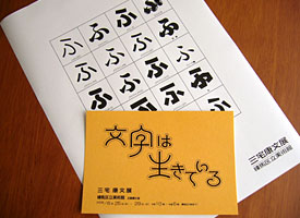
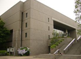
A typeface designer Yasuyuki Miyake’s personal exhibition titled Moji wa Ikiteiru 文字は生きている, means ‘The living letters’ was held at Nerima Art Museum in Nerima Ward, Tokyo. This exhibition had two parts. The one was themed Letter Design and the other was Letter Art.

He designed a lot of Japanese typefaces for more than fifty years, which were displayed in Letter Design room and showed 10 new typefaces as well. The famous round edged san-serif typeface family Jun from Morisawa Library and JTC Win family from Nis Library were also included. The large letters on the presentation boards were hand-trimmed black papers. He seemed to think it was important to draw letters by hand. And he showed some lettering works that designed names of sports athletes, entertainers and famous persons for several kind of magazines.

Meanwhile, there were a lot of print art works, which seemed to be silk-screen printings, in the Letter Art room. He dipicted several sceneries with Kanji letters 風 (wind), 雷 (thunder) and Kanji letters known as a symbol of nature. These letters were dynamic as if letters were alive and they were very unique and had humor feelings. I could find the difference between these two parts ‘static and dynamic.’

Left: The post card on the exhibition and Specimen sheet were provided at the gallery. Right: Nerima Art Museum.