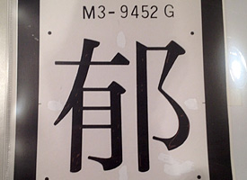
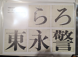
Role: a super family with more than 200 typefaces.

June 1st, 2019

Role family has been released from Fontelier, a new marketplace operated by Morisawa.
https://en.morisawa.co.jp/about/news/4566

Fontelier
https://fontelier.com/

I was commissioned by Morisawa in 2015 and joined this project until mid 2018 as one of type designers. Role has five styles as written in the description, then four styles, Serif, Sans, Slab and Soft except Script have been released this time. Details will be announced from Morisawa.

Matthew will talk about Role on June 15 at Typographics.
https://2019.typographics.com/schedule/matthew-carter/

Type Renoir in Hong Kong

October 6th, 2012

Type Renoir in Hong Kong, is a type design talk session by international type designers, will be held on Sunday 14th October 2012 at The Hong Kong Polytechnic University.

An annual international typography and type design conference ATypI will be held in Hong Kong from 10th to 14th October for the first time in Asia. Japanese type designers and graphic designers will be there as a speaker. Julius Hui, was a freelance type designer based in Hong Kong at that moment and joined Dalton Maag last month, proposed that this must be a great chance to have an extra talk session with Japanese type designers to share each other’s design situation. Then the session has been planed and will be held after the ATypI conference. Julius organized all and arranged the international speakers with Keith Tam, a type designer and HKPolyU School of Design’s Assistant Professor, and made a lovely poster for the session.

Speakers are as followings:

佐々木愛 Ai Sasaki
秀英体開発室 Shueitai Development Department
大日本印刷株式会社 Dai Nippon Printing Co., Ltd.

Amélie Bonet
Type Designer
Dalton Maag Ltd

秀親&塚田哲也 Hidechika & Tsukada Tetsuya
グラフィックデザイナー Graphic Designer
大日本タイポ組合 Dainippon Type Organization

両見英世 Hideyo Ryoken
タイプデザイナー Type Designer
タイププロジェクト株式会社 Type Project Inc.

譚智恆 Keith Tam
助理教授 Assistant Professor
香港理工大學設計學院 School of Design, The HKPolyU

岡野邦彦 Kunihiko Okano
タイプデザイナー Type Designer
Shotype Design

Paul Barnes & Christian Schwartz
Partners
Commercial Type

西塚涼子 Ryoko Nishizuka
シニアデザイナー Senior Designer
アドビシステムズ株式会社 Adobe Systems Co., Ltd.

羅小弟 Roman Wilhelm
Type Designer
roman946.de

岡澤慶秀 Yoshihide Okazawa
タイプデザイナー Type Designer
ヨコカク Yokokaku

Japanese members will be talking about their own works briefly. I also give a presentation about my typeface for the final project at Type Media master course of KABK (Royal Academy of Arts in the Hague Netherlands).

Type Renoir is a pop-up type and typography talk series hold by group of Japanese type designers in Tokyo since 2011. Type Renoir is named after Renoir cafe, is the popular reasonable cafe in Kanto region, mainly metropolitan area, providing the conference room that we usually use.

Facebook page is here.
www.facebook.com/typerenoir

Happy New Year 2012

January 3rd, 2012

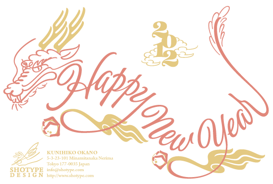
Happy New Year 2012! Here are my New Year’s card designs for 2012. Which did you get? 2012 is Dragon’s year in Japan (and some of Asian countries). Unfortunately I couldn’t send any New Year’s card last year since I was in the Netherlands and very busy working on the assignments of TypeMedia, so I’m glad I could send it again in this year.

I will turn 41 in May (hard to believe), so I’m plunging into a year called Yakudoshi in Japanese, which is believed that men turning 41 are likely to get an illness or misfortunes. So I got a special amulet to protect from misfortunes, but I don’t want to be afraid of plunging into Yakudoshi! I’m very excited.

Quintet has been released on Photo-Lettering

December 24th, 2011

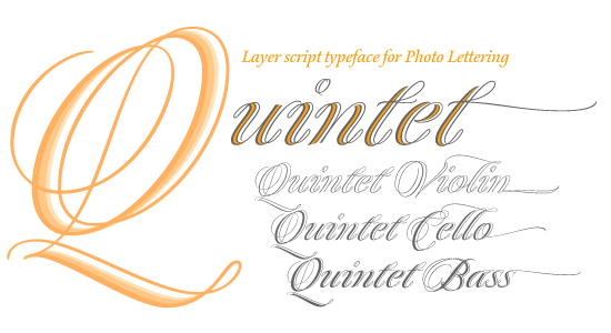
I’m very happy to announce that my own first retail typeface Quintet Script joins Photo-lettering Collection running by House Industries. This typeface was initially made for the Typeradio workshop, titled “Typographic Chinese Whispers” and was held in Feb. 2011, and restarted as the final project of TypeMedia 2010/2011 class at KABK in the Hague, the Netherlands. Quintet for Photo-lettering consists of a combination two exclusive weights (Violin and Cello) and one most heavier weight from the regular family to go well with Photo-lettering’s unique outline download service.

I hope you enjoy this typeface for your graphic, packaging or greeting card project. Its three layers create many colorful combinations or unique arrangement by applying emboss effect or metallic color or gilding to one of three layers. It must be also nice for a screen media such as a titling of video clips or web contents. You can get a lively titling image by applying animation effect to a stroke which looks like a double-stroke but consists of a single-stroke.

I also would like to release original five-layer design as an OpenType font, and now I’m preparing for releasing it but no schedule has been decided. If I’ve got a clear schedule or plan, I’ll disclose it here.

The reserch presentation on the Asahi Shinbun typeface.

December 8th, 2011

TOKYO — The presentation on the research for the Asahi Shinbun Typeface was provided by Akiko Nakai, assistant manager of the font division of Asahi Shinbun Co., at BIZ Shinjuku, Tokyo on December 8th. The Asahi Shinbun is the one of major newspapers in Japan and published the first issue in 1888 in Osaka then now became the second largest newspaper company. Nakai joined the font division about two years ago and attended Shinjuku Shijuku: 新宿私塾, literally means the Shinjuku private school and provides one year typography program organized by Robundo, is known as a publisher featuring typography, to get knowledge and skills on typography. The report was compiled as a final project of the curriculum. The presentation was provided not only by a slide show report but also a lot of physical stuffs from letterpress to digital Asahi used. They included many draft sketches and the Kanji letter press pieces including ruby, called Furigana, is a Japanese reading aid Kana characters along with the Kanji for indicating its pronunciation. Besides that, the stuffs marked “confidential stuffs” were also included and Nakai told that it must be rare opportunity to show them since we never took place like this exhibition.

Left: Draft drawing. Right: 35mm film for archive. Asahi sent them to IBM to digitize

Nakai explained in her presentation about the history of the Asahi Shinbun Typeface and showed many photos of the workplace to make the typeface. In the earliest time, Asahi bought typefaces from some Japanese type foundries such as Tsukiji Katsuji or Motoya Matrice, but after the WWII, as the amount of the publish was getting increase, Asahi decided to make an original exclusive typeface.

One of the interesting background stories in the design history was why they started making vertical compressed letters, now is known as a newspaper typical typeface style in Japan. As a possibility going to World War II were getting higher, paper supply and quality went worse. Asahi decided to reduce the amount of the pages per an issue and they made a small typeface, 6.286pt, to keep an equivalent information. But the complaint that the typeface looks too small arose not only inside the company but also from the readers, besides that, the government also required that the newspaper letters should be lager to protect the readers eyes. To solve this problem, the staff considered that the letters should be as large as possible without changing the amount of the information. Unlike Latin language newspapers, Japanese newspapers set text vertically. The staffs came up with the only solution to make the letters larger without changing the text length must be expanding letters horizontally. Considering that the eyes of the human being are on the face horizontally, an expanded typeface could have readability for readers. Since the Asahi Shinbun started using newspaper style expanded typeface, the rest companies followed to use it, and now vertical compressed Mincho style is regarded as a Newspaper style typeface.

Left: Draft drawing of Mincho style. Right: Draft drawing of Mincho Titling style.

Asahi repeated to make the letters larger several times and brushed up them as the typeface has been changed along with the transition of the mechanical three main methods from letterpress to digital.

The report was well compiled as an company history featuring its typeface, but I was a little bit disappointed that it didn’t deal with the detail of the design transition so much. Nakai showed some references using some Kanji letters, for instance “朝” that is the initial Kanji letter of the Asahi Shinbun, but I wanted to know how the Kana design transition had been made and the what the future typeface design will look like to fit the screen media as the Asahi Shinbun eager to make web site and smart phone applications to provide its issues.

Some of attendees who I met after the show told me that it was very good presentation, which was interesting. They seemed to be satisfied that the presentation. But I doubt it.

Asahi Shinbun typeface must have an equivalent design history to the Shueitai typeface, which is the one of main stream design typeface in Japan and turned centennial last year. The exhibition to cerebrate the centennial of Shueitai showed the long history and tremendous important stuffs. I’m sure Asahi also has the equivalent stuffs like Shueitai has. I hope they will publish the book on the Asahi typeface and provide more detail information in public.

A brief report on the Zapf Exhibition.

September 26th, 2011

The strong typhoon Roke that I’d never experienced since I came to Tokyo had passed, the sky looks clear and I couldn’t believe it was a stormy yesterday but some branches of the tree along the side of the street were fallen, which was the evidence how the typhoon was strong.

The gallery is located in the embassy area nearby Roppongi, where is known as one of the most attractive area in Tokyo for the tourist. I visited there twice during the opening days and came there today to say good bye to the awesome works. I hope to see them again and wish to have a chance admiring them at some point. But I thought this might be the final chance as it is very rare to see Zapfs’ works.

This exhibition was organized by Japan Letter Arts Firum and Akira Kobayashi of Linotype. It contains nit only calligraphy works but also type design works. Regarding type design work, Linotype brought the correction sheet of The most impressive thing of works was that all works create spurb results by their awesome technique. The edge of the terminals had a tiny hook made by the broad nib pen, the crossing point of the strokes never had any chunky result. To reach this level, I couldn’t imagine how much I have to pay attention to every letter and the texture of the composition and keep training for a long time and work on the project with big love.

I realized (I’m afraid to say that) the digital version Diotima didn’t look so exciting to me compared with the letterpress version. The digital version seems to have less rich curves and spoiled something important feature while the letterpress has a beautiful hairline arches like the lowercase n and h looked really thin and beautiful. I don’t mean the digital technology is inferior than the letterpress technique. It might be that I just never knew that the letterpress quality enable to create rich curves.

I was very surprised to know that the metal plate of Das Blumen ABC by a carver August Rosenburger was not an engraved plate but a relief printing plate. I couldn’t believe that these thinner strokes was printed by the letterpress technique! It reminded me of the type engineering lecture I attended few weeks ago. I learned digital fonts are made not only by the type designer but also by the contribution and efforts of font engineers who usually don’t appear. For a freelance type designer like me, in most cases, we need to make everything from design sketches to generate an OpenType font by ourself, which means that we need to have skills to draw precise lines and clear knowledge on printing technique, in recent days, the knowledge on the screen device is also important. Das Blumen ABC was not accomplished without the collaboration work Hermann Zapf and Rosemburger and his craftsmanship. In the digital font era, we have to be a good type designer and also font engineer.

Akira Kobayashi mentioned on his blog that the reason why letterpress Diotima’s outline looks so soft. As I had the same feeling when I saw it yesterday, so I was trying to mention about that on my report. Of course I didn’t know the detail reason about it but I’m glad to clearly know that the digital version spoiled some design features. The outlines of the letterpress had irregular holes and cracks on purpose so that the lines can generate jaggy effect, which creates the soft line and beautiful composition texture. We used to think this technique should be avoided to apply for a digital version, otherwise, the data footprint will increase and it causes something printing error, even though we don’t care so much now since the OS and printer performance gradually improved. But I realized that the similar technique might be useful and helpful to avoid mechanical impression from the digital fonts.

I had to think that I was very lucky to see the show because the show was postponed due to the huge earthquake on 11th March in Tohoku region. The show was originally planned to be held around March. I’d been in the Netherlands at that moment, so I didn’t expect I would be able to visit the exhibition.

Pre event talk show for Zapf Exhibition.

September 11th, 2011

The 6th Type Talks featured the Zapf Exhibition “Hermann Zapf & Gudrun Zapf, the World of Calligraphy” form 13th Sept. 2011 in Tokyo organized by Akira Kobayashi and Japan Letter Arts Forum (J-LAF), which includes some Calligraphy works and type design works. About 80 attendees were gathering to the ABC Aoyama Book Center and enjoyed interesting topics related to the Zapf’s works.

Minako Sando, is a calligrapher and representative of J-LAF, and Yukie Hoshi, is also a calligrapher and core member of J-LAF, explained the background stories of the preparation for the show and the visit to Zapfs’ house in last January to pick up their works. They talked about the meeting with prof. Hermann Zapf and Gudrun Zapf von Hesse with some interesting photos and the selection in their archive rooms. And then, explained some high lights of the works in the exhibition. She analyzed the letter forms and techniques in the works one by one from the Calligrapher’s point of view and explained the difference between letter forms focusing on the lowercase “d” in the Hermann work Quotation by Walter Crane. It has almost 30 variations “d” like the long ascender and the alternative letter form which has a curly ascender stroke. One of the examples showed the terminal of the loop ascender stroke looks continues to the following letter e and r. She guessed the order of the strokes if the e was written after the r or the stroke just looks connecting to the r. (Oh, hard to explain without the image!)

A Calligrapher and type designer Ryuichi Tateno, is a designer of Pirouette and Stevens Titling from Linotype, explained and demonstrated the Zapf’s techniques, a so called piano technique (means pen pressure transition during drawing the terminals of a stroke) and drawing strokes which was introduced in the book Creative Calligraphy published by Rotring in 1985, and the famous short movie The Art of Hermann Zapf by Hallmark cards.

And at last, Akira Kobayashi joined the talk via Skype from Bad Homburg, Germany, and talked about the high lights of the type design works by Zapfs, mainly the collaboration works with Zapfs, such Diotima and Optima Nova.
He mentioned about the design transition of the lowercase “g” of Diotima in developing phase for the metal type to the digital revival Diotima Classic. He happened to find a document file of Diotima in the Linotype archive room while he was preparing for the Helvetica exhibition in 2009. He realized the lowercase g had been changed several times during the developing process for about few years. And it continued in the collaboration works of Diotima Classic with Gudrun. Almost of the works he introduced in the talk show will be displayed in the exhibition. I learned a lot of high-lights of the works today, which must be helpful to admire the exhibition works.

In fact, Minako and Yukie came by to see me in the Hague during visiting to the Zapfs’ house as I was joining TypeMedia KABK. I was very glad that they somehow took a time and came to the Hague even though they were supposed to be busy preparing for the meeting and had to back to Darmstadt right away. They told me about the visit but seemed to be nervous to see Zapfs because Akira Kobayashi couldn’t join the meeting due to a cold even though they expected he introduced them to Zapfs. I just made a wish everything would go well and I was very glad again to hear yesterday that everything went well and they got a great experience with Zapfs.

I’m the one of big fans of Hermann Zapf, so I’m looking forward to the show. I’ve never seen of their works firsthand, so it must be a rare chance to take a close look at them. I have some Hermann Zapf’s books but I can tell the differences between the original and the picture. I wish I can steal their techniques;-)

The exhibition was planned in last March, but it had to be rescheduled in September because of the Higashinihon earthquake (the Great East Japan Earthquake on March 11). The show starts on 13th Sept. until 25th at le bain in Nishiazabu, Minato Ward, Tokyo, Admission 1,000 yen. It includes more than 50 pieces, Handwriting, Replica, Materials for font development, Metal typesetting, etc. A special program is also scheduled to show the DVD movie “The Art of Hermann Zapf” produced by Hallmark Cards Inc. on 18th and 25th Sunday 13:00 / 15:00 (twice a day). This show is highly recommended and don’t miss it.

AXIS Latin Pro won a Good Design Award

October 1st, 2010

AXIS Font Latin Pro won a Good Design Award 2010. The design farm of this font, Type Project won the Good Design Award straight three years since AXIS Compact series got it in 2008. Driver’s Font, which was collaborated with Denso, also got it last year.
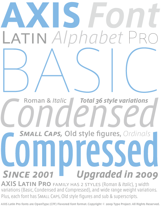
AXIS Latin Pro is the basically developed for Japanese font named AXIS Font in 2001 as a Latin portion. AXIS Font was designed by Isao Suzuki of Type Project. Suzuki was a former type designer of Adobe Japan and joined the design team that developed Kozuka family. He started AXIS Font project in 1998 for an exclusive font for AXIS magazine, is one of famous design magazines in Japan and mainly features architect, product and industry design. After he left Adobe Japan, he concentrated to make AXIS Font. After a while he started this project, he asked Akira Kobayashi, is now a type director of Linotype, to make Latin parts for this font. They developed this family, contains seven weights, for about three years, AXIS magazine started using this font when the magazine turned 20th anniversary and renovated its design format in 2001.

After AXIS magazine used it exclusively for about one and half years, AXIS Font was released in public in September 2003. It was widely used in several kinds of design field or a corporate use because of its high design quality. Apple Japan (Japanese character only), Mazda, Nintendo and some other major worldwide companies use AXIS Font for their corporate or branding images.

After AXIS Compact series released in 2008, AXIS Latin Pro was planed since the needs for multi language text setting are getting increase and widely required for the company and design farm which need to have communicate with customers and users across world.

After Akira Kobayashi left for Germany to join Linotype in 2003, Suzuki was looking for a new type designer who would be able to make Latin parts, then Kunihiko Okano joined Type Project in 2005 to make Latin part of AXIS Compact series, then continued to make AXIS Latin Pro family. After Okano left type Project in the end of 2007 and he started his design office called Shotype Design, he keep continue to make them and finally released in September 2009. To release this font as a Pro version, Okano developed Italic style, small caps, old style figures and specific characters, and compiled 36 styles, Roman & Italic, seven weights(UL, EL, L, R, M, B, H), three width variations (Basic, Condensed and Compressed), which create richly expressions and fulfill versatile typographic demands. Besides, more over than 700 characters supports 41 Latin alphabet languages across the world, so you can use them for the items, applications and medias which are available to use all over the world. This is the rare case, might be the first case, that the Latin part of the Japanese font released independently as a retail font.

AXIS Font exclusive dealer www.axisfont.com

Type Project: AXIS Font developer.

AXIS and AXIS Font are the trademarks of AXIS Inc.
Type & Media 2010/2011 at KABK

September 19th, 2010

I joined the Typemedia course at KABK (Koninklijke Academie van Bleedende Kunsten, Den Haag). I’m really happy to spend for about one year with these great guys. This is the first 2010/2011 class shot in the type park at Meermanno museum nearby KABK.

Left to right:
Florian Schick, Lauri Toikka, Sun Jung Hwang, Alpkan Kirayoglu, Linda Hintz, Colin M. Ford, Malte Herok, Kunihiko Okano (Me), Jan (“Yanone”) Gerner, Emma Laiho, Marina Chaccur, Yassin Baggar

Hiragino family joins the Morisawa Passport program

September 10th, 2010

I’ve got surprised news that Dainippon Screen Inc. announced that Hiragino font family, which is known as a Japanese font family bundled on MacOSX, will join the Morisawa passport program in the next update version in Autumn 2010. Not only Hiragino KakuGothic (Sans Serif), Mincho, MaruGothic (Round serif), also Yutsuki Kana series, Hiragino UD family, is a spin-offed version of Hiragino, will be bundled on the kit.

I was very surprised that news because Dainippon screen must be the last competitor to defeat Morisawa. The design quality of Hiragino products is brilliant, and Hiragino is bundled on Mac OSX and it generates much revenue to the company. So I believe there’s no worry that Dainippon Screen don’t have to use an annual license program although its variety of the fonts are less than the ones of Morisawa. Honestly speaking, I was a little bit disappointed that Dainippon Screen made a decision to join Marisawa program because every font maker should provide its products by itself. Besides, Morisawa is a competitor. I couldn’t believe Hiragino would join the rival program.

Most of Japanese major foundries recently started providing an annual font license program since Fontworks started Lets Program in 2004 for the first case in Japan. Morisawa followed to start the similar annual license program called Morisawa Passport in 2007, which has been welcomed by users and designers and getting increase its sales year by year. Then the other foundries, Iwata, TypeBank and Motoya started Lets program, and finally Dynacomware announced to start providing an annual license program called DynaSmart in the earlier this year. The reason why most of Japanese foundries plunged into the annual license program market, I guess the users seem to think it is very affordable and useful for getting several kind of typefaces at once despite paying the license fee every year. As you may know, typical Japanese typeface is very expensive compared with the Latin alphabet typefaces. It costs at least 10,000 per style, for example, the latest Morisawa passport contains more than 500 style typefaces and covers several kind of styles such as text, display, fancy, traditional and modern feelings, which is as much as a few million yen. Graphic designers must be happy to have them, then will be free from annoying consideration to buy new typefaces or asking their supervisor to get permission purchasing it.

I have to say the annual license program is very useful and helpful for users. From the point of type designers’ view, however, the royalty per typeface will be getting decrease as the contents is getting increase in the passport library. Do you think it must be a good business model for type designers? I doubt it. If Morisawa would not replace the contents along with the users’ demand or allow users choice the limited numbers of favorite fonts, the business model might be going to get the worse result at some point.