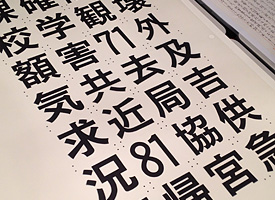
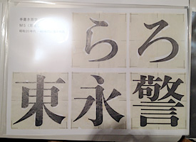
TOKYO — The presentation on the research for the Asahi Shinbun Typeface was provided by Akiko Nakai, assistant manager of the font division of Asahi Shinbun Co., at BIZ Shinjuku, Tokyo on December 8th. The Asahi Shinbun is the one of major newspapers in Japan and published the first issue in 1888 in Osaka then now became the second largest newspaper company. Nakai joined the font division about two years ago and attended Shinjuku Shijuku: 新宿私塾, literally means the Shinjuku private school and provides one year typography program organized by Robundo, is known as a publisher featuring typography, to get knowledge and skills on typography. The report was compiled as a final project of the curriculum. The presentation was provided not only by a slide show report but also a lot of physical stuffs from letterpress to digital Asahi used. They included many draft sketches and the Kanji letter press pieces including ruby, called Furigana, is a Japanese reading aid Kana characters along with the Kanji for indicating its pronunciation. Besides that, the stuffs marked “confidential stuffs” were also included and Nakai told that it must be rare opportunity to show them since we never took place like this exhibition.


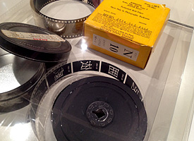
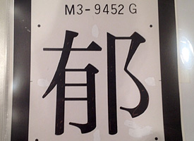
Left: Draft drawing. Right: 35mm film for archive. Asahi sent them to IBM to digitize
Nakai explained in her presentation about the history of the Asahi Shinbun Typeface and showed many photos of the workplace to make the typeface. In the earliest time, Asahi bought typefaces from some Japanese type foundries such as Tsukiji Katsuji or Motoya Matrice, but after the WWII, as the amount of the publish was getting increase, Asahi decided to make an original exclusive typeface.
One of the interesting background stories in the design history was why they started making vertical compressed letters, now is known as a newspaper typical typeface style in Japan. As a possibility going to World War II were getting higher, paper supply and quality went worse. Asahi decided to reduce the amount of the pages per an issue and they made a small typeface, 6.286pt, to keep an equivalent information. But the complaint that the typeface looks too small arose not only inside the company but also from the readers, besides that, the government also required that the newspaper letters should be lager to protect the readers eyes. To solve this problem, the staff considered that the letters should be as large as possible without changing the amount of the information. Unlike Latin language newspapers, Japanese newspapers set text vertically. The staffs came up with the only solution to make the letters larger without changing the text length must be expanding letters horizontally. Considering that the eyes of the human being are on the face horizontally, an expanded typeface could have readability for readers. Since the Asahi Shinbun started using newspaper style expanded typeface, the rest companies followed to use it, and now vertical compressed Mincho style is regarded as a Newspaper style typeface.


Left: Draft drawing of Mincho style. Right: Draft drawing of Mincho Titling style.
Asahi repeated to make the letters larger several times and brushed up them as the typeface has been changed along with the transition of the mechanical three main methods from letterpress to digital.
The report was well compiled as an company history featuring its typeface, but I was a little bit disappointed that it didn’t deal with the detail of the design transition so much. Nakai showed some references using some Kanji letters, for instance “朝” that is the initial Kanji letter of the Asahi Shinbun, but I wanted to know how the Kana design transition had been made and the what the future typeface design will look like to fit the screen media as the Asahi Shinbun eager to make web site and smart phone applications to provide its issues.
Some of attendees who I met after the show told me that it was very good presentation, which was interesting. They seemed to be satisfied that the presentation. But I doubt it.
Asahi Shinbun typeface must have an equivalent design history to the Shueitai typeface, which is the one of main stream design typeface in Japan and turned centennial last year. The exhibition to cerebrate the centennial of Shueitai showed the long history and tremendous important stuffs. I’m sure Asahi also has the equivalent stuffs like Shueitai has. I hope they will publish the book on the Asahi typeface and provide more detail information in public.
