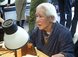
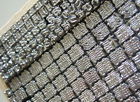
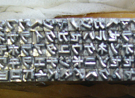
The last letter engraver Kinnosuke Shimizu.
Monday, January 11th, 2010The type event in 2010 started with the letter engraving demonstration at the Ota Bunka no Mori, in Ota Ward, Tokyo. An engraver craftsman Kinnosuke Shimizu, who turned 88 years old on that day, is one of the last letter original engraver craftsman in Japan.
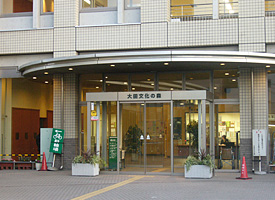
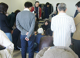
Left: Ota Bunka no Mori center in Ota Ward where the demonstration event was held. Right: Attendees were gathering around Shimizu’s table.
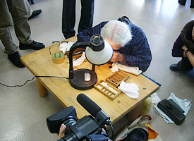
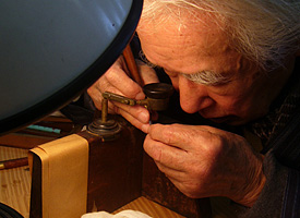
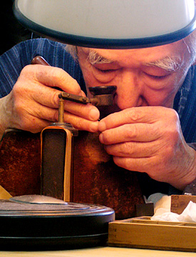
When I entered the room, he already started cutting letters sitting on the floor in front of a wooden work table. A bunch of attendees were gathering and crowded around his table. A desk lamp illuminated his fingers, but it is hard to see how he cut the letter because the metal stick he was going on was very small. Sometime, the stick he picked was shining in his fingers. Using an old loupe, Shimizu gazed at the stick. He sometime rotated it, and the tiny chisel was slightly moving on the top of the stick. He showed superb technique and made letters slowly one by one. He seemed to be very fine. It was hard to believe he turned 88 years old today.
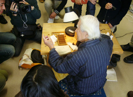
Left: Shimizu was sitting on the floor toward his work table. Right: Shimizu explained how to curve letters to attendees.
While he concentrated cutting letters, often said that “Let me know if you have a question, I can answer them working on demonstration.” So I hesitantly asked him some questions.
According to him, he started cutting letters when he was 14. He worked hard all the day, it took about five years to cut letters well. The workshop he joined had five craftsmen, included him but it had few dozens craftsmen at peak, which produced about fifty letters per day.
I expected cutting tiny letters such a ruby, so called Rubi in Japanese and is used for a furigana superscripts, takes a longer time than larger ones such Shogo 初号. But he told me that “Cutting smaller letters are easy. Rather, large size letters need to take a time. They require accurate quality, so, it took much care for cutting them. While cutting average small letters takes about a twenty minutes, but average large size letters such Shogo take a few hours. Of course it depends on its size and complexity.”
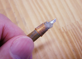
Left top: He gazed at the stick through the loupe. Right top: A tiny stick he picked was shining in his fingers. “Cutting reversed letters is easier than writing normal letters. I can’t write normal letters well,” he said with a smile.
“Do you have any pupil or is there any followers to try to make it?” I asked. Then “No, there’s no demand for engraving letters at all, but I can teach you if you want,” he answered with a smile. “Because of appearing new technology, (might be the Benton cutting machine and a photo type setting technology) most of punch cutters had to retire, then he left the job about fifty years ago. After some decades passed, however, some type designer asked me to demonstrate cutting letters at the letter press event. At first, I denied because I forgot, plus I no longer had tools for that. But my wife still had all of them. So, I tried to do that, then I could,” he explained.
“I would like to say thank all of you guys. Thanks to everyone’s help, I have been a craftsman for a long tome and am able to show this demonstration today. It was a pity when I lost a job because of new technology, but I’m happy I can show you guys cutting letters due to all of your interests,” he added.
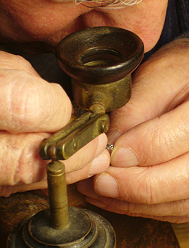
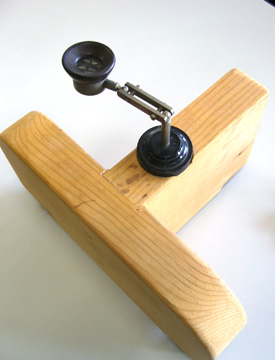
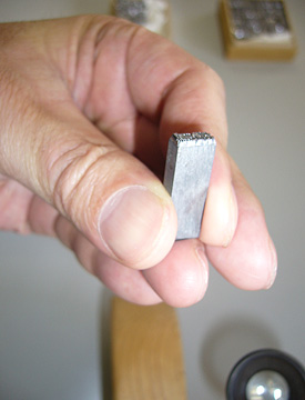
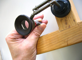
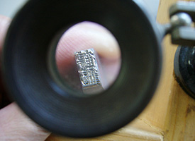
Left top: A T-formed loupe stand he customized. Right top: Hold a letter stick like this. Left bottom: Left hand which holds a letter stick is set on the end of the horizontal bar, and right hand which grabs a chisel is put on the right side. Right bottom: An enlarged letter stick reads 鶴龜 pronounce Tsuru Kame, means crane and turtle, which are the symbol to bring happiness. 鶴 has 21 strokes, and 龜 has 16 strokes within about 5mm square each.
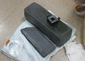
Left: A grind stone, Right: All chisels he uses are made by himself. He customized them to fit his hand and fingers. Meanwhile, counterpunches are used in making Latin alphabet punches, Shimizu grave letters without any counterpunch. Almost of Kanji letters have many complicated crossing strokes, which create thousand kinds of counter shapes. That’s why, making counter punches to fit all kind of counter shapes is not economic way at all.
When we are talking about a font regardless of digital or letterpress, we tend to focus on type design or typography, which is to say what we can see only. However, the fonts we have now and letterpress on an old book were provided by the collaboration between designers and engineers or craftsman like Shimizu. Without craftsman/engineer’s skills and big efforts to making fonts, these are never provided to users. When we get a font, I think we have to imagine not only designers but also craftsmen and engineers who had worked hard to make it.
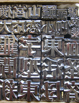
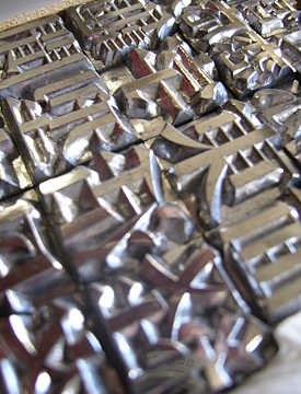
Left top: Shogo 初号, engraved directly by Shimizu. Right top:Original letters made by Shimizu were displayed at the corner in the room. Visitors were able to see the superb skills Shimizu had. Letters were shining and glaring and had sharp edge. Left bottom: He prepared these letters for this event. Right bottom: Rubi letters. Katakana letter within 2mm square.
As I mentioned above, it was the Shimizu’s 88th birthday. After the demonstration event, the birthday party celebrates his Beiju “米寿, 米 consists Kanji numeral 八十八, reads eighty-eight, and 寿 means celebration” was held nearby the event place. That’s too bad, I couldn’t join the party, but I was sure the party must be exciting. I hope to see his demonstrations again. Congratulations, Mr. Kinnosuke Shimizu.
Gratitude:
To know some terms for letterpress and electrotype, I asked typophilers about them here. I would like to say thank to those who helped me out.
