Talk event, the exhibition Typeface found in Setagaya Ward, Tokyo.
Sunday, January 18th, 2009Do you know the name of typefaces that you can see in downtown?
A type designer Naoyuki Takeshita is a notable designer not only making his Japanese font named Take:竹, means bamboo which was named after an initial of his family name 竹下 Takeshita, was distributed by Morisawa, but also his blog titled Machide mikaketa Shotai, 街で見かけた書体 means ‘Typeface found in downtown’. He introduced a lots of typefaces and fonts which were on billboards, traffic signs or shop signs while he was hanging around downtown. He often posted photos on typefaces he found to his blog with a comment using a lot of humor. As he is a typeface designer for Japanese font, he knew almost of typefaces not only old hot metals and photo type setting but also the recent digital fonts, so he can tell what the name of the typeface quickly.
Takeshita’s exhibition titled Setagaya de mikaketa Shotai 世田谷で見かけた書体, means ‘Typeface found in Setagaya Ward, Tokyo’ was held at the Setagaya Culture Life Information Center. The project started last July by the request that Hasegawa, was the organizer of this exhibition, asked Takeshita for searching typeface in Setagaya, because Hasegawa was interested in Takshita’s blog and wanted to held the exhibition. The project has been started last August, then Takeshita came to Setagaya several times to take photos. The exhibition was compiled by the best selection. As a pre-event, he also started a blog titled Setagaya de mikaketa Shotai 世田谷で見かけた書体 from the beginning of last December, he continued to post some photos and comments in the same way he had done on his blog before until the end of last year.
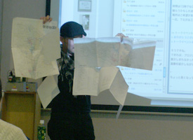
Left: Takeshta talked about this project. Right: Hasegawa showed the map that they used while the research. The map was almost tattered because of overused.
The talk event had two parts, the first, Takeshita showed the typefaces which he had seen in Setagaya by category, billboard sign, traffic sign, railway sign and public sign. He introduced the typeface we don’t know, and signs we usually don’t take care about, such as a mark on the road called Doukai, 道界 which indicates boundaries to divide properties.
The second, he picked up the things which he was interested in, non-typeface letters such as logotype and hand writing letters, and introduced the food shop or restaurants he had take a lunch while he walk through downtown. ‘One of funs when I researched downtown was looking for a nice restaurant or a food which are famous in Setagaya,’ Takeshita said. ‘I didn’t search any restaurant in advance at all, I decided the shop for a lunch after coming to the research place. ‘If I found a nice billboard or facade, I tried to enter the shop and had a lunch’, he continued.
‘I found the main purpose of this project was not knowing what kind of typefaces are in Setagaya but finding characteristics of Setagaya by looking for typefaces’, Takeshita said looking back the research. So, I asked that ‘I’ve heard you had found a lots of typefaces on signs around Tokyo before this project started, did you find the difference among Setagaya Ward and the rest area where you had ever visited? Plus did you find the specific trend for typeface in Setagaya Ward?’ He answered that ‘As I mentioned, the main purpose of this project was to know about the specific trend in Setagaya, but it was a pity that I couldn’t find it, but I found different topic. I live in Saitama prefecture (northern neighboring Tokyo), so I could find the difference that each public region has own regulation way where the public signs should be placed.
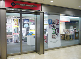
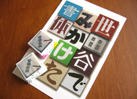
Left: The exhibition space. Right: The direct mail of the exhibition and the novelty chocolates that delivered to visitors. The chocolate imitated the mark on the road Doukai 道界.
According to Takeshita, some of who saw this exhibition wanted to see what is the situation about another district, as there are 22 wards in Metropolitan Tokyo except Setagaya. I thought it must be hard work for Takeshita. I knew he spend a lot of time to finish this project. It was not easy work at all. However, I also know he can’t stop looking for typeface in downtown, he must be going to start another project soon because he is always searching typefaces and fonts everyday. I hope he will plan another project which features area he will be interested in.
Related topic.
ICOCA Card with typeface “Take”


