Talk show with two type designers, Kataoka & Okazawa.
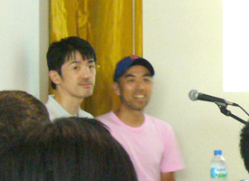
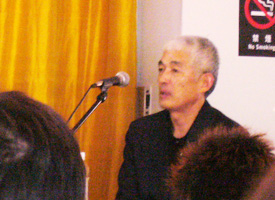
Friday, August 8th, 2008A really interesting talk show with two type designers for Japanese fonts was held at 5tanda sonic: pronounce gotanda sonic. Akira Kataoka, who designed unique Ming-cho style font named “Maru ming-cho: 丸明朝” and “Maruming old: 丸明オールド” , and Yoshihide Okazawa, who works for Jiyu-Kobo, which is one of the leading design companies for Japanese fonts and was famous that Jiyu-Kobo designed Hiragino family that bundled with MacOSX.
Maruming old is unique Ming-cho style font that have rounded edges and traditional skeleton, especially Hiraganas and Katakanas. There was no style like Maruming ever before, so a lot of designers welcomed to use it into their works. I think you might see Maruming old at least once a day in the posters everywhere you go and the commercial films while you see TV programs.
Left: Yoshihide Okazawa (Left). Right: Akira Kataoka
They started with looking back days when they started type design for the first time. Okazawa talked about his college days when he started to design letters. “Emigre and Neville Brody were hot in that days,” he mentioned. As he is my age, I had a lot of similar experience with him. I also started to design when I was college student using Fontographer 3.1 as I’ve got an impression of Emigre and Neville Brody. Okazawa finally made a Japanese typeface, using a function of Japanese word processor, which was able to make letters, for his graduation works. As I knew the way of making typeface using word processor was very hard and needed a lot of times, so it was hard to believe his story. If it was a true, I thought his energy for making fonts was enormous.
Kataoka also mentioned his old days and episode when he started to design letters for the first time. While he worked for a design office, he always wrote a lot of letters on presentation boards for a business show that the client would be held. And decades passed,the economy situation turned down around 90s, known as the collapse of the bubble economy. “I needed to have special skills so that I could survive the severe economic situation,” Kataoka said. He thought that he could draw letters and love to draw letters. “If I could make a font, I could have it as a property,” Kataoka continued.
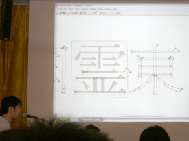
At the second part of the show, Okazawa demonstrated how to make Japanese digital fonts that Jiyu-kobo did using a software named “Bezier editor” from URW. According to Okazawa, Jiyu-Kobo usually begins with making basic reference characters for Kanji letters. They always draws two Kanji letters “国:country” and “東:east” to decide basic design for a starter. The reason they begin with these letters is that these two letters have several kind of characteristic elements for Kanji letters such as serifs, strokes, counters and body size. After that, they scan these images into the PC and traced them using Bezier editor. Then repeat this process for basic 12 letters as well.
The part of Kanji letters that they made before were available to share with the rest letters. For example, in case he wants to make the letter “明”, he assembled the left part of “昭” and the right part of “朝”. It must be revised to fit the space where the part should be, but it’s faster way than making all parts one by one.
I was astonished that he controlled bezier curves to fit the sketches very fast!! It took around only ten minutes per one letter. I was sure he had a lot of experience to control bezier curves. That’s why he did it very quickly.
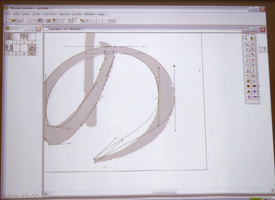
Then, he demonstrated how to design Hiragana letter “あ”, which is a phonetic character that we pronounce it “a”. “To make all parts of (more than 7000) Kanji letters, we just draw only few Kanji letters, on the other hand, we need to draw all (more than around 100) Kana letters to design them” Okazawa said. I guessed Hiragana and Katakana have a lot of gorgeous curves, so they need to draw all Kana letters in order to decide the design of Kana characters. The skills of drawing letters by hand must be faster than controlling bezier curves.
Left: The basic letters “国” and “東”. Jiyu-Kobo judges several kind of factor such as body size, counter, serif and weight by these basic letters. Right: Okazawa demonstrated how to trace the letter “あ”.
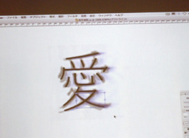
Meanwhile, Kataoka showed his method to design Kanji letters. “I think the skeleton of the letter is very important factor to design letters” Kataoka said. He usually gathered several style of typefaces that he was interested in, not only old and ancient ones but also the one his staff drew by hand. Then, he selected two completely different style of typefaces and overlapped them. He picked up overlapped image and traced it. I thought it was like a blending method. The letter that he traced overlapped image was completely different design compared with the typefaces he selected at first. According to Kataoka, the way of design of Maruming was the same method he demonstrated. I thought it was very unique method to design new one.
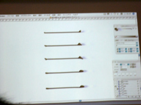
Left: Kataoka picked up a image by overlapping both of two different images. Right: The horizontally stroke elements for Kanji letters as a prototype.
I’ve already heard how to make Japanese font, but I’ve never seen the method directly like the way they introduce this time. I thought these were very interesting and I was happy to see live-actions. I was pretty sure these fascinated audiences.
